Journey Border

Daqadoodles141026zo133103

This card was made a year ago. Or a year and a half ago. I really liked this card so I wanted to make a good post about it. Perhaps sell the background digitally. Oh well, i let the dream of a webshop go, as it doesn’t fit my other ideals of less waste and less controbution to waste and posession in this world. I am kind of tired of things revolving around selling things people don’t need, just to make profit to grow bigger and to sell more… I do not want to empower that even more (I know I do by buying things, but hey, I’m trying hard on other areas in my life to be living a sustainable, ecofriendly life!)

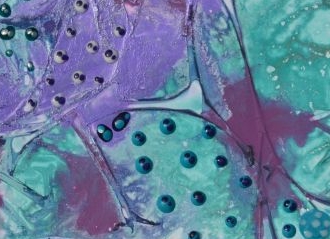
Anyway, this wasn’t about the card. Or perhaps it was? In my mind the card was named Journey, as the little dots were making a journey across the card. Like microorganisms travelling. Oh this picture really doesn’t do it justice.

The background was made with the paint and kitchen foil technique, as mentioned here. It didn’t need much more, i didn’t want to cover this background a lot so I just made little dots with perlen pens and marbled those a bit.

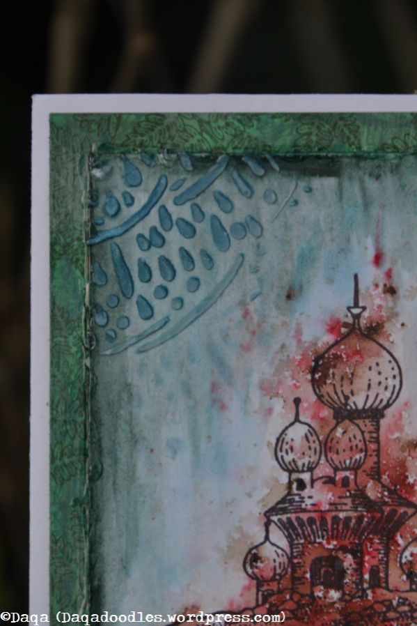
The card needed a frame, but not an ordinatry one. It should fit with the journey/stone like feeling. So this was the start:

Daqadoodles140924wo121045

Distress ink pumice stone and forest moss through the cell theory stencil of TCW. Then with the marker spritzing / airbrush tool from ranger add the specks to the stones while the mask is still laying down.

Daqadoodles140924wo124343

I’m not sure anymore what I did here, but I know it involved clear embossing one layer. Eventually all layers were clear embossed but I can’t remember in which order.

Daqadoodles140924wo123128

Daqadoodles140924wo124403

Which way is up?Daqadoodles140924wo123139


Below: After clear embossing the layers, add more distress ink.

Daqadoodles140924wo124637

See how the center lights up? I loved this stoney effect of the border! Like an opening in  a strange cave you look into. Or out of.Daqadoodles140924wo124619

I tried this again on another piece of paper.

Daqadoodles140924wo121022

Also made a a frame with modeling paste. Looked better on the other ” frame”  card then on the turqoise and violet/purple card.Daqadoodles140924wo121102 Daqadoodles140924wo121110

Daqadoodles140924wo121332


So as often is the case, I made a less attention attracting border with distress ink and sponges and distress markers and the airbrush tool.

Daqadoodles141026zo133103

Daqadoodles141026zo133306

Daqadoodles141026zo133408

Oh the card looks so.. different on the pictures. The dark purple spots look very random (they are), but the focus is on the little microbes and their journey. They change colour while travelling, as they encounter things that change them. Let’s see if I can find a closeup.Daqadoodles141026zo133103CU1

Daqadoodles141026zo133103CU

That doesn’t help either. It’s just one of those cards you have to see in real life. And maybe to you it’s nothing special, to me it was.

Come to think of it… these pictures are taken 24th of September 2014, my niece was still in a coma after a severe accident in June where she suffered a major headinjury. She had had another major surgery two weeks before (a piece of her skull that had been removed in June because of swellings was placed back, so she was ” whole”  again), and I  think I was hoping that her cells were regenerating and filling the gaps. New connections being made. Lost connections being restored or regrown. We still didn’t know wether she would a.) wake up. and b.) if she did, would she be a “vegetbale”? How much of her was still there? My youngest son was 3 months old then, and he was growing. His cells were regenerating, dividing, expanding. I hoped hers  would too.  She did wake up, slowly, and slowly became more conscious of the world around her again. She couldn’t move a thing, could only watch. With extensive training she learned a lot again. Nowadays she’s in an electric wheelchair. The left side of her body still doesn’t function easily, and she hasn’t gotten her speech back yet, but lately she’s making more sound / saying words. We’ve got good hopes that she will speak again without a computer. See here for the Dutch episode of ” Geef om je hersenen”  for the Brainfoundation. From 36:00 there is a story about Vanja, it’s almost the same story as my neece her story, only she has rehabilitated more.

A journey. Through memories and emotions. A journey to healing, full of hope.


Banksy and more

It’s been quiet here, but luckily I occasionally find some time to craft.

Here are a few cards again.

The first few were made from a big background I had made maybe a year ago (See Goodbye Lullabye part 1 and part 2). As the colours are very bright it just laid there, me not knowing what to do with it. Adding another colour would not fit. Then I got some Banksy stamps from Vivalasvegastamps, and some Art Journey stamps – both are stenciled style stamps, very suitable for stamping in one colour.

Daqadoodles151213zo1307n6731

Background made with TCW cell theory 12×12 stencil. Text is from Indigo Blu and the painter is from Banksy via VivaLasVegaStamps.

The card isn’t rectangular, the lower right corner is 90 degrees, but the upper left is bigger.  I felt that fit the sentiment better then a straight card.

Daqadoodles151213zo1307n6730


Daqadoodles160128do1604n6902

Same background stencil (TCW cell theory 12×12). Droplet branches and girl with umbrella are from Art Journey. The text is probably from De-Stempelwinkel, I love this poetry /proza kind of text. Lets imagination roam freely.

Daqadoodles160128do1604n6903

Daqadoodles151006di235208137

Oh this one isn’t finished yet. What I did here so far is add a layer of modelling paste through a TCW stencil. I stamped the Banksy girl onto regular tissue paper, carefully removed the upper layer of the tissue paper so there is only one layer left and then used decoupage glue on the card and carefully laid down the tissue on top of it and smoothed it out. It tears easily so be very carefull and accept a few folds here and there. To make the edges of the tissue paper less obvious, don’t use scissors to cut out the image but tear it out, the ragged edges blend better.

I’m back in a bit with more cards!

A last minute move


A last minute post for the Chocolate Baroque Colour Challenge #10.

Daqadoes150519di232032010

As it’s last minute, it’s nightphotograpy unfortunately. I’ll see if I can get a daylight picture edited in this week.

I started this card by placing a stencil and going over it with distress stain bronze. I then lifted off the stencil and placed it on another piece of cardstock (This is where the chessboard is stamped and cout out from), so there’s the positive and negative image of the stencil. I then applied ink – a mix of shaded lilac & dusty concord, spun sugar, and again a mix of victorian velvet and seedless preserves. (although dusty concord and seedless presevers could have been swapped). The metallic stains act as a kind of resist, so it still stands out a lot.

I stamped the chessboard onto the other cardstock. I had inked it up with  Stazon cherry pink and violet (something). I added some more white pen on the chesspieces and castle, but it didn’t really cover the distress stain so I left it as it was.

I had started other cards before this one, but the balance of colours was always off, there wasn’t enough white in it. So I left the chessboard just as it was, it was good like this.

Daqadoes150519di232155007

I glued the card in place onto white cardstock, leaving a strip of white on the right side for balance. Oh I almost forgot, I stamped and heat embossed the text ofcourse.

Daqadoes150519di232005009

So that’s it, it was a difficult challenge for me this time again and a lack of time also, but I am satisfied with the result, although I like the other card I made more. Thanks for visiting!

Edit: the outdoor picture taken this morning, no sun / bit cloudy:

Daqadoes150520wo064324002

Goodbye Lullabye – Part 2

See my previous post for what this is all about.

Here are some before and after pictures. The ones wrapped in foil is when it’s just been wrapped, the other ones is 6 hours later in the morning unwrapped (the youngest was awake very early, so short night… decided to craft a bit :P)

Daqadoodles150418za052014032

This is the right cardstock in the picture above, but turned 180 degrees.

Daqadoodles150417vr210551006

Daqadoodles150417vr210535007

Daqadoodles150418za052025031

This is the left linencardstock in the above picture.


Daqadoodles150417vr210600005

Daqadoodles150418za051905035

Theupper right card turned counterclockwise 90 degrees. You see what can happen when you take of the foil while the paint/paper isn’t dry yet. I didn’t mind a lot, as it was fixable and created some more light space to stamp on.


Daqadoodles150417vr210610004

I only wrapped these in foil partially.

Daqadoodles150418za051954033

This is the right card. The paint is shining more where the foil has been.

Back to last night, as I wasn’t done then.

Daqadoodles150417vr211351003

As I often forget that the size of the paper where I stamp the images on will be smaller then the card size due to matting it on other papers, I precut it to the desired shape this time. I often create the background first and then trim the paper to size, but I end up not wanting to cut through pretty spots etc…I had planned on throwing out the cutoffs, but I had some paint left so I swiped them through it. Didn’t have enough paint left ofcourse to cover the strips properly so I added some more paint and pushed the papers around. I thought I might use the strips on the cards. Painty fingers is the result.


Daqadoodles150417vr211715002

When cleaning out the brushes I got this… and *sigh* ofcourse I thought it looked nice and could be used for another card, so I saved it….

So, the brushes are cleaned (picture taken at 21:17hrs), the cards are drying. Read Ryn’s blogpost. Get inspired to make something of the other backgrounds (see previous post). Think: Oh, 10 more minutes, just going to try it out for a bit. Nothing too elaborate.

Riiiight…..

2 1/2 hours later:

Daqadoodles150417vr224105042

Sprayed with ink, but this time I had thinned it (mister, water, spray the inkspray into the mister, shake, spray on a kitchen towel, and use). So it was a bit lighter. Spray abundantly, and add salt to it, it will absorb the moist and create lovely random patterns. The salt had been used before – I wonder if it will still work as good. The piece is still lying on top of the piano, I haven’t checked it yet. (Yes poor family, every surface here is used… coffeemachine, piano..


Daqadoodles150417vr224125041

I don’t think I have used thinned ink on this one. I applied a coat of modpodge on it, you can still see the milky parts of it. This acts like a kind of resist. Stamping with water based ink isn’t possible, but stazon will work. And gesso and paint ofcourse.


Daqadoodles150417vr233002040

The celltheory stencil was stamped on this one previously, and now I had replaced it and sprayed it lightly with the thinned orange ink, it really contrasts with the green. I’m still not sure how this one will end. I’ve used Ryn’s stencil here (the pink bits) nd a rose stencil. (orange and green bits).

Daqadoodles150417vr233006039

A closeup. It looks interesting now, but where to go from here? I added modelling paste through the stencil onto some of the roses after taking this picture.


Daqadoodles150417vr233012038

The bottle allready was almost empty, really! Only 1/3 of a glass in it left… Anyway, I used stencils on stencils (although the paper in the middle is really the last scrap paper where I pressed the stencils on before cleaning them. I’m not sure if I’m going to use that one. Then again, why not?


Daqadoodles150417vr233020037

And the red pepper one with the thinned poisoned jade and turqoise one. It looks like it’s giving off light. I’m not used to working with neoncolours, don’t even like them, but this will be another challenge for me, to work with these colours.

At 23:30u, it was time to clean up and go to bed. I I had known I’d be up at 05:15 the next morning I would have gone to bed sooner…


A fairytale baby

This card I made for a collegue whose second son was born on Christmas day. I used to work with him a lot, but then I moved and now I am attached to another office of the company and also I do not work at the office anymore but am working at a clients office. I only heard last month that his son was born.

Daqadoodles150225wo235455006 There was less good news with that news too: the little boy was in the hospital with an unknown infection.
The top stamp I had seen at VivaLasVegaStamps a while ago allready, and had revisited the site and revisited. This stamp still stayed on my wishlist. It reminds me of the old fairytale books I used to read, this style of drawing. Recently they had a big sale, and having some money to spare again I finally placed an order, inclusing this stamp.  (Fairy Princess – 18095). This was before I knew about the day of birth of this boy.

Daqadoodles150225wo235626009

So when I heard the news, I went through my stash of new stamps (I usually start there) and saw this one. This one was perfect. The name means “(the)blessed”. And born on Christmas day? – This stamp was perfect. A fairy, sending blessings out over his name, winter in her hands. I stamped her in blue, as she is an ethereal being and not present in this world. She is only visible for those who look. For babies, who are still partly connected to the spirit world. Also the sun, symbol for light or enlightment, fit together with the crane perfectly. The crane stands for luck – it is said a crane brings good luck. Some light in dark times: the birht of the boy. The light also is hope, and luck from the crane, for a good recovery. Stars ofcourse also match his birth day.

Daqadoodles150225wo235613008

The first letter is a stamp from a steampunk VLVS alphabet set, and the others are die cut from a Sizzix alphabet die (inked with stazon moonlight blue). The crane is from Designs by Ryn, and the sun from Stampinback. The text is from Stampendous (I think) – it’s also the only black on the card, the main colours are blue and yellow (and gold, if you don’t count that as a shade of yellow). The star stencil from The Crafters Workshop. The banner from Sizzix/Tim Holtz. The crackle stamp is from Indigo Blue. Hmm that is stamped with onyx black I think – I meant to use the grey versafine but had mistakenly taken the onyx black.  The stars where first bright yellow, with acryllic paint. Too yellow to my liking, too harsh. So I put some distress ink antiqued bronze over it, just very lightly, to tone down the yellow and make it shimmer a bit at the same time.

Daqadoodles150225wo235638010

The sun is embossed on parchment paper, and then cut out. I made several, but one was enough. I had also embossed and cut out several more birds (on plain cardstock): 2 for the parents, and 1 for his older brother who has pneumonia. (Hopefully that is over by now). The card would be too busy if I added all 4, and it was about a birthcard for the youngest. I had allready sent a different card with well wishes for their health.

It’s quite a large card, fits just in a standard wide envelop (for A4 paper folded in 3). I do like the card a lot, with it’s symbolism and meaning. Hopefully my collegue recognizes the meaning, and hopefully he and his wife enjoy the card.

Daqadoodles150225wo235557007

Adding this card to Designs by Ryn customer Creation Challenge – March

Live, Laugh and Love

And craft up another card for Designs by Ryn february challenge:

Daqadoodles015

It’s a card with quite some layers and techniques, has been a while since I did that. I started with inking the background and then stamp and emboss the gentleman (Tim Holtz stamp) with clear embossing powder. I stamped and embossed patio stone from Designs by Ryn.

I put down some stnecils (Might have used a star stencil too, but the clocks from Tim Holtz are quite visible) and inked again. I looked through my stash of cutouts and found a long strip, (tattered banners) die cut, inked up allready. Torn in two it’s perfect for two words, and the 3rd word in the bottom.

The man is looking down, towards his watch? or his heart?

The harts and wings (ok they’re leaves from a ranger thinlits strip diecut) are from my stash as well.

Daqadoodles150121wo121952013

This is where we are now.

Next I added the backing paper – torn pages of an old book, glued it on cardstock, my kids helped me with that by putting the glue on the cardstock. Isn’t the grungy style great for that? Just put the (decoupage) glue around a bit, leave some spots open maybe, and it will act as a resist too.

After this I used modelling paste through 3 different stencils (the dots from Tim Holtz, the roman script from TCW and the harlequin figure from Prima/Finnabair).

Daqadoodles150128wo204229009

Daqadoodles150128wo204211008

The splitpens were from my stash as well, I had used them previously and put some stazon black on them to make them a little bit darker/duller.

Daqadoodles150128wo204258010One more indoor picture to end this post with.

I was – as always – fun to make this card, I hadn’t used modelling paste in a while as it requires more cleaning in between and more drying. Hmm the colours look to dark on this last picture. grmbl indoor photography… The scan isn’t right either, the outdoor picture (of the unfinished card) looks best, but it’s unfinished… Oh well, maybe your monitor balances the colours out right again ;).

Daqadoodles015

Vintage ladies

[edit… And now this post has a title.]

Changed avatar, changed header of the blog, got a facebook account for crafting things. Now it’s time for the last post of tonight. Sorry for spamming you guys (or rather, girls, mostly), but I like to have all things I make on the blog, it’s also some sort of crafting diary.

As said in the previous post, now it’s time for two lovely vintage cards with FrenchKissed images in the center.

Daqadoodles141030do100516

I loved this lace-lady ever since I had seen her in the shop. My printer doesn’t do her justice. Lots of layering of stencils and stamps on the surrounding card, with Chocolate Baroque butterfly, Sizzix flower die, probably also a Marianne design die, the text is a clearstamp from …?(a well known brand too). I’m not sure if the thistle stamp is Chocolate Baroque or not, I did buy it there, but it was part of a grabbag so I don’t know from which set it is or if it’s even CB. The swirl in the upper right and bottom left is a free stamp I got when buying stamps at a dutch stamp store (I think it was at a crea-event, so can’t remember which store). There’s also a peacock feather on it (clearstamp, probaly cArt-us), a TCW stencil (tree branches) and a reverse image of a stencil (the turqoiuse bit). Think I mentioned it all now.

Daqadoodles141030do100522

Oh wait, the tiny label die, isn’t it cute? it’s from eh…eh…

… let’s head on to the next card!

Daqadoodles141026zo132421

The background was originally for a CB colour challenge, but I didn’t like how it turned out. The white stamping wasn’t really as crisp as I hoped. So now it would be a background paper. Other stamps used are from Prima Marketing – Pixie Glen collection. The main image is FrenchKissed postcard again. I stamped the roses, clock and banner on the card, then stamped again onto other cardstock, coloured, cut out and glued on the card.

Daqadoodles141026zo132443

It’s a busy card, has a vintage feel to it, but it’s also my style of card, not too vintage-y with lots of added 3d flowers and lace. This vintage card still fits flat in an envelope with normal postage ;).

Home sweet home

Playing with bister, it gives nice backgrounds but then what to do with it? Well, why not stamp over it and use the bister as colouring of the image.. And so I did. I stamped a fairy castle over it, the red representing the magic that flows from the building, or the pixie dust. It’s actually an underwater castle (Chocolate Baroque), so it could also be a mermaid hideout. Tiny mermaids then, as the castle is small.

Daqadoodles141108za143951

After that I added more colour around the image, the green is added distress ink (ink on an acryllic block + waterbrush).

Daqadoodles141108za144012

I then created the frame, it was on bright green cardstock. I stamped over the frame with several tree stamps / leaf stamps from Chocolate Baroque. I say frame because it is a frame but placed behind the center image. I cut out the inner part of the backing paper to save weight – 20g is reached quite fast.

I placed a stencil, a Crafter’s workshop one that has to do with underwater (forgot the name), and applied blue distress ink through the stencil. Next, I applied molding paste (moulding paste? I know one is unhealthy fungus and the other means shaping, but which one is which.. hmmm…). The paste absorbed some of the colour of the ink beneath it and got a nice blue colour. I cleaned the stencil and replaced it and added a bit of perfect pearls blue powder on it. (Gah me and names).

Daqadoodles141108za144026Last I glued the main image on the frame and added the glossy accents in a non straight and non-clean line all around the image/frame. It’s quite hard to try to make the line wiggle and look like applied with a shaking hand when you intend to do so.

Daqadoodles05

It does have an underwater feel to it, doesn’t it? So my initial idea of a fairy home – well, it’s a waterfairy home now!

This is my entry for Melissa’s Vandicrafts Artistrsy Challenge #17 – Home Sweet Home.