
My entrance for the Chocolate Baroque colour challenge #8 this time is not a card, but a tin can. It all started last Friday, when we were too tired to cook so we decided to get fries. In order to add some healthy food to it, we had soup as well. I know, home made soup would be better, but I am not much of a soup person. Not for making nor eating. So we had soup from a can.
In the evening, I saw the can and thought: hmm let’s try out that new big bold background stamp from chocolate baroque on it! So I got my stuff together and started.
In the next few days I decorated some more of the cans that were allready in use as pen holder. Results vary, and I still don’t know if I like them. I think I’d like them better without the gold.
Let’s start with the colours:

Challenge 8
As I planned to use the decoupage technique with mod podge (decoupage glue) and tissue paper, I didn’t not want water soluble inks, so I searched for matchin colours in my Stazon stack. I notice now that my colours are off a bit. The colours I used: Midnight Blue, Vibrant Violet, St. Valentine (which is too red now I see the image) and Pumpkin. Also used/ tried out: Viva Decor Inka Gold: Oldgold.

I took some tissue paper, the stamp, and inked up the stamp with various colours ink. Then I inked up the brayer and rolled it on the uninked parts of the stamp (as I didn’t want the ink on the stamp get on the wrong inkpad). I think I inked it up with Pumpkin, as it all turend a bit more orange. Fun effect of rolling ink on a brayer (and then the brayer on the tissue paper) is that you get a negative print of the stamp. Above, you se al tools used. The tissue paper that is lying there remained unused, the brayer apparantly wasn’t clean enough when I used blue on it, the orange mixed too much with the blue.
How to decoupage a can:
First time I glued part of the can, as it might be easier to trim the excess paper off. But I started putting it on with a slight angle so I didn’t end well and had to take the paper off. Ofcourse, that meant glue on the paper – that was just as easy. So put decoupage glue on your tissue paper royally, spread with the foam brush. Work fast. Line up the can with the paper, and put the can down, picking up the first bit of the paper. Lift it all up carefully, and with a dry brush (I used an old toothbrush later on), carefully brush over the paper. Brush most wrinkels out, or leave them in (I should have left more in in hindsight, I like the wrinkles). Be sure to brush over the entire surface that needs to be glued and a bit around it so the paper follows the exact contours of the can. After this layer is on, you can use the foam brush to put some glue over it again, be careful you don’t move the tissue paper or break it. If you are patient (unlike me) you might want to wait till the first layers has dried. When you have covered the surface, the starting point is almost dry again. Get your torn pieces (see below) and put plenty of glue on the spot where you want to glue the pieces – put glue on a larger surface then your piece. Bits where there is not enough glue will not turn “transparant” as much, they’ll stay white and/or there will be air bubbles beneath it. 
Stamped on a normal tissue paper, a Kleenex. You can see the layers of the kleenex on the upper red figure, only use the top layer. Tear the images out – torn edges blend into the background very well as the fibers vary in length / get thinner when torn. When you cut, you get a clean even edge, which makes it harder for the tissue to blend into the background.
Here is my table with stome tools on it and a binder with the CB stamps.

added the small violet figures.
Also added midnight blue peacock feather flowers.

And a large red figure with a violet one on top. Also visible is the inka gold which I used – on the bottom and top rim and random on the can.

Next morning. This is what the second tissue paper for the can looked like. A good impression on the paper is also achievable by putting the paper on the stamp and then rolling with the brayer over it. The dvd was one that was just broken by my son by pulling ito ut wrong.
I used the violet as background now, but it was too light, so the can was quite white still.

With inka gold.
 And inka gold on the wrinkels.
I still wasn’t convinced about the cans, so next time I used only 2 colours: 1 for the background, and 1 for the motif. The other colours woule be torn pieces decoupaged on.
Yup, I like these colours more. Hardly visible is the orange piece on the blue can – I noticed I didn’t take pictures of that side.

The back of the red can. I didn’t use kleenex this time, but tissue paper. You can see it blended less well then the kleenex which was used on the can to the left. The right can doesn’t have torn pieces decoupaged on. 
The first can looks very rusty – the metal of the can, the orange and gold – it does look a bit too much like the can that had been outside for too long :P. The top can is too white, and too many colours still. The bottom cans look good, purple background and red motif, with blue and violet figures on it. The big can: blue motif, violet background and red and orange figures. If you think out the red and use the colour combo: Midnight blue, vibrand violet, pumpkin and inka old gold it would have matched the colour challenge more.


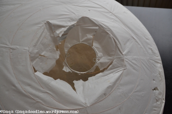
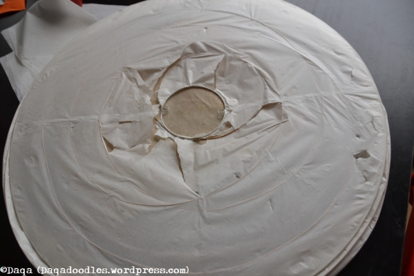 Here it’s lying flat, ready to be fixed.


 Jaren geleden heb ik het blauw gebeitst. Het was lelijk, en stond altijd ergens uit het zicht. Nu heb ik het veranderd met behulp van behangproefstukken, mod podge en spuitverf op de zijkanten:


