Dive

I enjoyed making the previous card and loved the outcome so much, that I wanted to repeat the recipy: choose which one of the four colours will be the accent color, and choosing 1 or 2 as main background colours. The other colour is used for colouring. The colours I used were the ones from the Chocolate Baroque challenge 34.

Continue reading

Timeless

Just about an hour or so untill the challenge closes, so I’ll hurry!
Pictures taken just a few minutes ago, so bad light – I’ll edit the post tomorrowafternoon with some daylight pictures.

Daqadoes150616di233352003

With flash.

Daqadoes150616di233335002

I started with a background made with the Ginko Stencil from Designs by Ryn, I used Distress inks ofcourse. Chipped Sapphire (or Broken China or Faded Jeans? I used all three colours this evening…) and Cracked Pistachio and Peacock Feathers.  Also Dusty Concord and Seedless Preserves. After making the background I stamped some thistles on it from Chocolate Baroque, and then spritzed with home made resist spray. Next I embossed the butterflies on (stamp from CB). From left to right: Adirondack Stream embossing powder (quite a thin/fragile line). The next one is a brandless embossing powder picked up from a euroshop or bookshop. I notice the difference in quality, this one doesn’t “flow” or melt into itself as well. Next on the right is Ranger Blue Glass – this one melts very well into a thicker bit. Details can get lost but it adds indeed a blue glass look. The bottom row is twice WOW! Earthtone Grape regular, I’m always a bit disappointed how it turns out. Looks nice in the jar but a lot darker after embossing.

Daqadoes150616di233455004

I next coloured the butterflies partly with matching distress markers. Or almost matching (pine needles and peacock feathers for the Stream butterflie, Worn lipstick/Spun sugar for the middle one, tumbled glass/broken china for the Blue Glass one and Dusty concord and Stormy Sky (which is not like the distress ink Stormy Sky, the marker is quite purple). The thistles are stamped with Distress inks, seedless preservers and dusty concord. I took my waterbrush, made it quite weat and mixed the colours – also the background colours mixed in.Daqadoes150616di233516005

Then I added Crackle accents to the 4 butterflies on the edges, and glossy accents on the middle one.Daqadoes150616di233607006

Strange things the picture does to the card – The texture in the more pink butterfly isn’t as high here, and the colours in the lower right aren’t as .. oh wait they are. Didn’t look like that after colouring, but it looks great!

Next thingI did was ink the edge royally with broken china, so the butterflies stnad out more.

Oh and then ofcourse the sentiment – I applied some gesso on the spot where it would go and wiped it out with my finger, inking it up a bit with cracked pistachio. Embossed the sentiment with Ranger super fine detail black embossing powder.

Almost the last thing I did was spray it with water to get the drops effect. Ofcourse last thing I did was make up the card as seen.

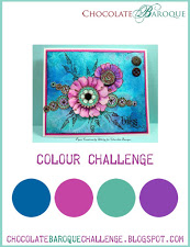
This was my 3rd entry for the Chocolate Baroque Colour Challenge #11

734be-cbc_10


Now the bonus card:

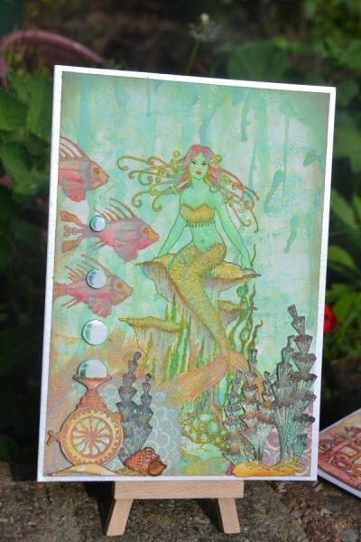
When I have to wait for something to dry I make another card. This often results in 4 or 5 backgrounds/cards which I am working on in one session. Usually 2 or 3 are finished. I was playing around with the thistle stamp a bit, I liked it 🙂

Daqadoes150616di233839001

I used the same distress inks and embossing powders as before. I inked up the bold thistle stamp and sprayed it with water to get a more blurry effect, I repeated this several times. Then I took the other thistle stamp and used another colour and stamped it.

I spritzed with resist spray and let it dry.Daqadoes150616di233645007

I inked up the rest of the card with blue/green colours.

Embossed the bubble wheel. Next was the fish. I didn’t mask it off when stamping the fish with embossing ink (wiped the embossing ink away in the bubbles and then wiped the embossin powder that ofcourse now stuck to the whole bubble away. The seahorse is stamped with Stazon Midnight blue – I didn’t want it to stand out as much as the other two stamps.  Daqadoes150616di233745009

I felt the detailed thistles weren’t clear enough, and the bubblewheel was too much at the front (should be behind the plants more) so I stamped and embossed the detailed thistle several times with a mix of the pink/purple embossing powders. Looked better now. Then some simple colouring with markers.Daqadoes150616di233726008

Don’t pay attention to the stamplines – I’ll have to cut the stamp a bit narrower or stamp more carefully next time. I added glossy accents to the bubbles and eyes of the fish and seahorse and mounted the card as seen.

Tomorrow hopefully some daylight pictures – it looks like bronze embossing powder but it’s black, I promise!

Thanks for visiting 🙂


Daylight pictures:

Daqadoes150622ma150549005

Autoadjustment from Photoshop:Daqadoes150624wo102228005

Daqadoes150624wo102213004

Shere Khan in the jungle

Not sure about this card. Closeup it looks better then from a distance, due to the colours I think. It does look like a moist indian jungle, filled with heavy scents and lots of plants. This was the atmosphere I intended for it. Maybe with a different backing card… At least I used up some scraps again, as the backing card came from my stash, made it a few years ago even when I just started cardmaking I think! I did add some distress stains to it to get more of a camouflage/jungle look.

Daqadoodles150202ma212527001


The background was made earlier with bister. I made several backgrounds then and this is the first card made with these backgrounds.

This is my third entry for Designs by Ryn Customer Creation Challenge of April.

Stamps/materials used:

  • Tiger – Sheena Douglas Crafters companion
  • Text – Sheena Douglas Crafters Companion
  • Leaves – Designs by Ryn
  • Patio Stone (in the red/orange/yellow background) – Designs by Ryn
  • Foam swirl stamp used on the background card.

Here are some other cards I made about half a year ago but I think have never showed.

They started out as scraps, as I had just received these fishes stamps and wanted to try them out. I stamped it on a long strip of blue/green paper, and then decided to play around with it. I cut it up in 3 or 4 scenes, but didn’t take pictures of all the finished cards I think. I know at least one card I gave to my mother for her to use as a birthdaycard for someone.

Daqadoodlesscan07 Daqadoodlesscan08

This one was made later, starting point was the turtle which I hade made a while ago with a background of alcohol inks onto the backing paper which was on the stamp when it arrived.Daqadoodles150121wo121942012

Watch out for my next post, it contains some cards/half finished cards that are failed or just not right!

Journey through an exotic reef

A short post this time, as I’m tired. No interesting text this time, so just sit and relax and watch the aquarium. Uh photo’s.


Daqadoodles141021di215305

(Was also made for the Vandicrafts Artistry challenge: birthday, but I am too late for that one. Hmm maybe I am on time for anything goes?)(Oh too late for that one too, but the current theme fits as well: make your own background.)

The reef is printed. The origin is a background I made earlier. (See the post about marbled pearls). I scanned it and edited it digitally, then printed. This will be available in my shop too.The fish is from Designs by Ryn, the seaweed is a crafter’s workshop stencil, and the text is Stampendous. (could be wrong there).

After printin the background I stamped the fish with Stazon Pumpkin or Crimson red. Then I took my distress inks (ripe persimmon, wild honey, dried marigold, rusty hinge, and maybe a few more), dabbed them onty an acryllic block and took a waterbrush to colour the fish. I also went over the edge of the reef and a bit in between the stones with that brush – the ink of the printer is watersoluble so the colours brighten a bit.

Daqadoodles141021di215959

I then masked off the fish and coloured the water around her, using a distress marker and a waterbrush. Then I placed the stencil and coloured it with various green/red colour distress inks. Only after that did I remove the mask from the fish.

To finish it off I added paper/gloss/perlen pearls to the overhanging of the reef. (Now that I look at it, next time I should make bubbles from them!). I did some marbling in them. The eye of the fish is made with the gloss/paper pen first, then let it dry and cover the pupil with glossy accents.

Daqadoodles141017vr153457

Last, I stamped the sentiment. To make it stand out more I outlined the text with a white pen.

Ink the edges a bit and glue onto a card – this could be quite a fast card! Looks lovely, doesn’t weigh too much (to keep the postage costs in check) and looks cheerfull.

I’d like to enter this card into the following challenges:


Lucky origami crane and blue fish

Not a very creative title or post this time, both are just very descriptive (and a short post, at least it’s short to me!).

Materials for the first card:

  • wallpaper from a sample book
  • stazon ink
  • scissors/paper cutter and glue.
  • Origami Crane from Designs by Ryn
  • Origami Lily from Designs by Ryn
  • Three leaves set from Designs by Ryn
  • Caran d’ache neocolors
Origami Crane

Origami Crane

As you can see, I didn’t add a sentiment yet, I’ll do so when I know the occasion. Plenty of space for it :).

How to make it:

Cut up the wallpaper. I cut up randomly first, then started gluing down and cut parts to fit more or less. After gluing it down I put some ink on the cutting lines to make them more visible. Glue them onto some scrappaper, don’t worry about the edges – make it larger then the rectangle, cut it to a rectangle later on. (or another shape with your embossing machine or a free form). Stamp the images with Stazon or another ink that holds on shiny smooth surfaces (as this wallpaper was shiny and smooth, and most wallpaper is “washable” nowadays, so dye based ink will not set on it probably). The stamping wasn’t very well visible, so I used my caran d’ache neocolor crayons to add some colour to the flora and crane. You can cut it to a rectangle before stamping or after, not sure what I did but I don’t think it matters much. Ink up the edges, glue upon a base card and you have a simple, sort of modern card. I left lots of room for a sentiment – either for a long quote or a simple one word sentiment would fit. The latter woul turn it into more of a mens card – being more metallic looking and with straight, hard lines in it and few words ;).

On this image you can see the shiny surface better, and the stamping is not really what draws the attention: (A card with effect!)

Daqadoodles14_06_05_141422

The next card is a blue fish in blue.

Used materials:

  • Dylusions ink spray
  • caran d’ache neocolors
  • Butterfly fish from Designs by Ryn
  • Sea Bubbles from Designs by Ryn
  • White gel pen
  • Black pen

Daqadoodles14_06_05_141417

How to make it:

Spray ink onto a large acryllic block, put your paper on top of it and press flat. Pull paper off (don’t drag) and let dry (or use a heat gun for impatient ones like me). Take your pattern stamp (sea bubbles here), spray wome water on them and stamp on the card. Dab dry with a cloth – you are basically removing the ink where you have stamped.

Stamp the fish. Wet the little fish and dab again to remove more ink in the fish so he is either lighter or you can more easily colour him in. Colour the fins, add some highlighting with a gelpen and make the eye white. With a water soluble crayon, go around the edge, then go over it with a wet brush. Take your black pen and sketch the frame, add a few white lines as well.

Before sending this off I added a sentiment “Have a fantastic birthday” where I changed the fantastic to fintastic, highlighting the “i”. Furthermore, I coloured the fins even more – I made a maks for the fish, cut off the fins and used the bodymask and the negative of the mask to cover up the card, leaving only the fins visible, then sprayed it with Perfect Pearls mist copper. I partly stamped rising bubbles from his mouth, (only a few bubbles) and used a white gelpen for highlights. Then I added Glossy accents to it’s eye and the bubbles and send it off to it’s receiver without taking a picture! At least I think I did – I can’t find more pictures of him. If I do find them I’ll add them here ofcourse!