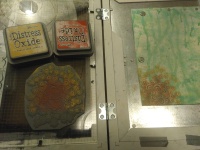
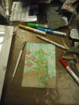
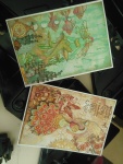
I enjoyed making the previous card and loved the outcome so much, that I wanted to repeat the recipy: choose which one of the four colours will be the accent color, and choosing 1 or 2 as main background colours. The other colour is used for colouring. The colours I used were the ones from the Chocolate Baroque challenge 34.
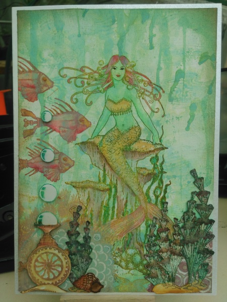
(Do you know that now it doesn’t look like cracked pistachio but more like peacock feathers? It really looked like cracked pistachio on my phone… ah well, at least I’ve been consequent). Only colours used: Distress oxides cracked pistachio, barn door, fossilized amber and vintage photo. Also used: Stazon valentine red and pupmkin, glossy accents, spectrium noir sparkle pen, distress stickles. Also used the distress markers (same colours) – the cracked pistachio was a lot darker from the markers! Used it for the cut out plants.
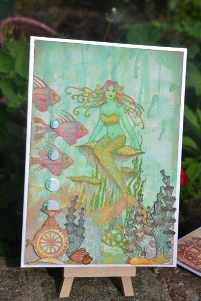
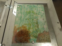
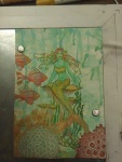
Previous card was a bird, but with and earthen feeling to it. This time I wanted the sea. I made some error along the way ofcourse, makes it all the more challenging ;).
I still love the endresult though. Only thing it lacks is a nice quote, which I wanted to stamp very lightly in cracked pistachio so not very visible but faded a bit. I didn’t have a suitable water quote though, would have loved the one from Moses Ibn Ezra: “Dive into the sea of thoughts and find there pearls beyond price.”
-

- Repeat stamping the waves Harlequin Fragments. I should have changed the pattern a bit more, stamping like the top row.
-
- Although, with the amount of water I added to the (watercolor) card the ink run out quite a lot so the image was mostly visible in my mind 😉
-
- Didn’t wait for it to dry this time, I helpd a hand.
-
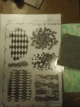
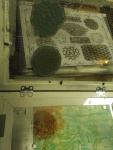
- The stampsheet Harlequin Fragments
-
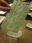
- Adding more colour – the card was still to white.
-
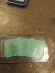
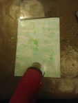
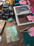
- I inked up an acryllic pad with oxide ink and sprayed it with water, then held it over the paper and let the water run off the block onto the paper. I caught the excess water again with the acryllic block.
-
- Next I stamped this stamp also from Harlequin Fragments.
-
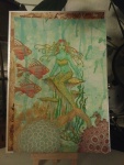
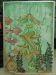
- Only remembering afterwards that I should have stamped the mermaid first.
-
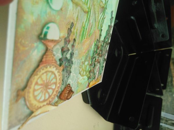
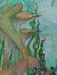
- The mermaid from Mermaid Queen is stamped, but not straight and her fin was showing in front of the “coral” – for depth effect this is not possible.
-
- Tried covering up the tail with a stamp from Texture Fragments, but it turned out too heavy.
-
- So applied gesso to it and coloured the mermaid, stamped the fishes from Steampunk Sea World

-
- Stamped again the same stamp over the gesso
-
- But still wasn’t satisfied so I figured there should be something in front of it.
-
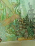
- So I stamped these seaplants from Seadragon and Mermaid Queen and fussy cut them out.
-
- I also stamped and cut out the air bubble device from Steampunk Sea World
-
- My daughter of 4 is also making cards.
-
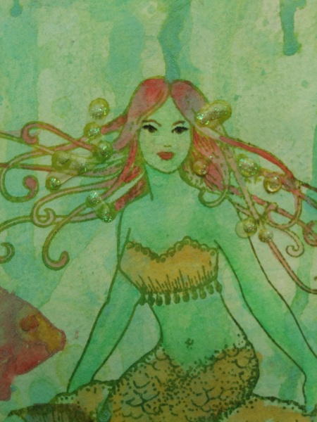
- Spectrum Noir clear sparkle pen on the mermaids body and tail and bubbles. (Her skin is shiny too, bit fishlike).
-

- Glossy accents on the bubbles
-
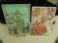
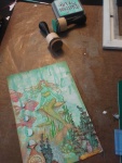
- The pair together. The cards are A5 size, whereas usually I make A6 size. But loved making them this size!
-
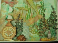
- OH also added a seashell from one of the sea sets and hidden behind a plant is a little seahorse.
-
- As many crafter knows – taking pictures is difficult. The shinyness of her skin – i just couldn’t get it on the picture. also the colours in the picture seem different (on screen) from real life.
-

- Crystal stickles and glossy accents on the bubbles in her hair. Her eyes have the only black on the card. (I’m even wondering if it was black and not just walnut stain).

Wow this is beautiful! Love the dreamy way you’ve used the challenge colours. A stunning design full of lovely details. . Thanks so much for joining us at Chocolate Baroque Colour Challenge
Claire xx
Thank You!
Another brilliant card Debbie, great layering of stamps to create your scene. Thanks for another fabulous entry into the Chocolate Baroque Challenge, Judith xx
Thank you again for your nice comment. I started this card the same as the previous card but the mermaid wouldn’t be properly placed if I would cut her out and place her on the foreground. She had to be furthest back in this scene. Because I hadn’t planned it that way I had some challenges. But love the card equally as the other.
WOW – another totally stunning card. Good luck with the Chocolate Baroque Challenge x.