Dragons and their treasure

Here is the third entry for the Chococolate Baroque Challenge #34, the dragons card in the middle.

Here they are. Maybe I should call this set Og3ne as I finished the last one watching the Eurovision Song contest!

The idea was formed – I had an underwater card, an “on the ground” card so the next card would be off the ground. Not necessarily in the “air” – in space, another dimension… A dragon and his treasure.

Dragons with glittery bellies from sliding across the treasure, geometric and clean shapes like sparkling gems.

Continue reading

Dive

I enjoyed making the previous card and loved the outcome so much, that I wanted to repeat the recipy: choose which one of the four colours will be the accent color, and choosing 1 or 2 as main background colours. The other colour is used for colouring. The colours I used were the ones from the Chocolate Baroque challenge 34.

Continue reading

Why not? 

It’s been a while since I took part in a challenge. I liked participating as it gave me new ideas and forced me to really look at colours or designs. But then I won… And I felt it wasn’t fair to keep playing if others haven’t won once yet. I like others to have a chance as well.But it’s been a while and I still see all the artwork from the DTs of my favourite sites. I came across a challenging colour combination – the green seemed too bright to combine with the rest.  But it did have a rusty metalness too it as well.  Hmmm… Ideas… And the colours did match my new distress oxide inks as well. 

Continue reading

Autumn again

Nothing to do with the cards, but the fact that time keeps moving relentlessly. Seem every autumn I’m spending more energy then I have – how I wished I could just take time off work from the 1st of October untill the end of january. Sort of a wintersleep. Alas, in modern day society taking such a time off is hardly possible. Not working is hardly possible – we could manage but would have to flip every coin twice. Don’t look forward to that, so I’ll just keep going on.

Eventhough I haven’t blogged, it doesn’t mean I haven’t created. It just meant I spent what little time I had on creating tangible things instead of some bits and bytes.
I do regret to say I haven’t had time to read other peoples blog either. So maybe I just did them a favour – I didn’t read theirs (yours?) but you wouldn’t have to worry about not reading mine as there was nothing to read. On to the cards now, as that is why you are here. (Right?)


Journey Border

Daqadoodles141026zo133103

This card was made a year ago. Or a year and a half ago. I really liked this card so I wanted to make a good post about it. Perhaps sell the background digitally. Oh well, i let the dream of a webshop go, as it doesn’t fit my other ideals of less waste and less controbution to waste and posession in this world. I am kind of tired of things revolving around selling things people don’t need, just to make profit to grow bigger and to sell more… I do not want to empower that even more (I know I do by buying things, but hey, I’m trying hard on other areas in my life to be living a sustainable, ecofriendly life!)

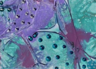
Anyway, this wasn’t about the card. Or perhaps it was? In my mind the card was named Journey, as the little dots were making a journey across the card. Like microorganisms travelling. Oh this picture really doesn’t do it justice.

The background was made with the paint and kitchen foil technique, as mentioned here. It didn’t need much more, i didn’t want to cover this background a lot so I just made little dots with perlen pens and marbled those a bit.

The card needed a frame, but not an ordinatry one. It should fit with the journey/stone like feeling. So this was the start:

Daqadoodles140924wo121045

Distress ink pumice stone and forest moss through the cell theory stencil of TCW. Then with the marker spritzing / airbrush tool from ranger add the specks to the stones while the mask is still laying down.

Daqadoodles140924wo124343

I’m not sure anymore what I did here, but I know it involved clear embossing one layer. Eventually all layers were clear embossed but I can’t remember in which order.

Daqadoodles140924wo123128

Daqadoodles140924wo124403

Which way is up?Daqadoodles140924wo123139


Below: After clear embossing the layers, add more distress ink.

Daqadoodles140924wo124637

See how the center lights up? I loved this stoney effect of the border! Like an opening in  a strange cave you look into. Or out of.Daqadoodles140924wo124619

I tried this again on another piece of paper.

Daqadoodles140924wo121022

Also made a a frame with modeling paste. Looked better on the other ” frame”  card then on the turqoise and violet/purple card.Daqadoodles140924wo121102 Daqadoodles140924wo121110

Daqadoodles140924wo121332


So as often is the case, I made a less attention attracting border with distress ink and sponges and distress markers and the airbrush tool.

Daqadoodles141026zo133103

Daqadoodles141026zo133306

Daqadoodles141026zo133408

Oh the card looks so.. different on the pictures. The dark purple spots look very random (they are), but the focus is on the little microbes and their journey. They change colour while travelling, as they encounter things that change them. Let’s see if I can find a closeup.Daqadoodles141026zo133103CU1

Daqadoodles141026zo133103CU

That doesn’t help either. It’s just one of those cards you have to see in real life. And maybe to you it’s nothing special, to me it was.

Come to think of it… these pictures are taken 24th of September 2014, my niece was still in a coma after a severe accident in June where she suffered a major headinjury. She had had another major surgery two weeks before (a piece of her skull that had been removed in June because of swellings was placed back, so she was ” whole”  again), and I  think I was hoping that her cells were regenerating and filling the gaps. New connections being made. Lost connections being restored or regrown. We still didn’t know wether she would a.) wake up. and b.) if she did, would she be a “vegetbale”? How much of her was still there? My youngest son was 3 months old then, and he was growing. His cells were regenerating, dividing, expanding. I hoped hers  would too.  She did wake up, slowly, and slowly became more conscious of the world around her again. She couldn’t move a thing, could only watch. With extensive training she learned a lot again. Nowadays she’s in an electric wheelchair. The left side of her body still doesn’t function easily, and she hasn’t gotten her speech back yet, but lately she’s making more sound / saying words. We’ve got good hopes that she will speak again without a computer. See here for the Dutch episode of ” Geef om je hersenen”  for the Brainfoundation. From 36:00 there is a story about Vanja, it’s almost the same story as my neece her story, only she has rehabilitated more.

A journey. Through memories and emotions. A journey to healing, full of hope.


Déjà vu?

My computer gave up a few weeks ago and, after getting new parts, was restored to a point in january. I am sure I’ve posted some of the next cards allready, but can’t find proof… Then probably it was only on facebook. (Or just because they’ve been waiting to go online for several months?)

PC is fixed now, and in a better spot in my house which means I can sit rather comfortably behind it, and all the diseases are slowly diminishing.

I’ve visited the Art Specially Event in Nijkerk at the 10th of April, and ofcourse didn’t stick to my budget. Which means I now own a small round gelliplate and pan pastels. I couldn’t remember at the event WHY I didn’t get it before or what had put me off, but I did remember as I was playing around with them at home. It means a new range of products I am going to need to collect…. It’s probably my subconscious trying to keep feeding the addiction, as I have told myself I’ve got enough stamps and cannot get more. Still many many uses with the ones I’ve got. So I am only allowed to get materials that are used up. Like glue and the new distress inks, markers. I didn’t intend to get new media… really…

Ofcourse now you expect a post about my experiments with it – but alas, as I’ve said this is about older cards from before my trip to Nijkerk. (It was a strange trip. No constant talking in the car, no questions, no ” Mom,..Mom..Momm!). It was strange. I thought I’d love it, sing out loud with my music, feel “free”, but it wasn’t like that. The music didn’t do the trick. My mind was still going everywhere and nowhere. Probably because I had an extremely busy week I was a bit numb. The event was good, I participated in a take and make (gelliplate and pan pastels…) and got my mojo back. I hadn’t been crafting in a few weeks due to ” reasons”  (had moved my crafting supplies and wasn’t sure I liked the new storage, not used to it, not wanting to make a mess (tired), got a cold etc..)

I’m digressing, again.

Cards…

Daqadoodles151105do150413136

Made with cutoffs from other cards. Glue them on cardstock, add some finish to it (I used Mod Podge decoupage glue) and stamp a sentiment on it.

Daqadoodles151105do150818147

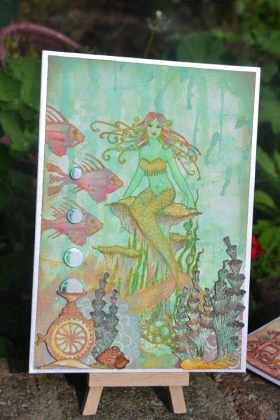
This one has been almost finished for a year or more. I had just the panel with the mermaid, not sure if I had put the dots (paper pen dots) in the swirls then, that might have been a later addition. All I did to finish it is (maybe add the dots and) frame it… Chocolate Baroque mermaid and Designs by Ryn swirls and School of Fish.

Daqadoodles151125wo1555$N134

Chocolate Baroque text and Sweet Pea Stamps (discontinued) Meredith Dillman’s Lady in Green. Stamped onto a background made with acryllic pewter paint.

Daqadoodles151105do150202130

The reverse stamp of a stencil of Designs by Ryn onto glossy cardstock, and one of her Colibries.

Daqadoodles151105do150218131

Also reverse stamp of a stencil (Hibiscus) onto clossy cardstock and a Hummingbird. Text is from the Boadicea sheet from Indigo Blue

Daqadoodles151105do150041127

Text is from Quietfire Designs, background stencil is Japanese Anemone from Designs by Ryn, and the dove is from a dove/pear themed Chocolate Baroque stampsheet.

Daqadoodles151125wo1556n6681

Art Journey stamps against a pewter and silver acryllic paint mix background.

Daqadoodles151213zo1307n6732

Hmm I’ve shown this one, haven’t I? Or only on facebook? In that case: It’s the Queen of Hearts by Rachel Anderson from Sweet Pea Stamps (discontinued). Crackle backround is Indigo Blue. The pinkish background is a leftover piece from a year ago.

The leftover piece on which the queen of hearts is stamped is from this set of cards, I even mentioned in the post I saved it (it’s the piece of paper I cleaned my brush on…)


Daqadoodles151213zo1308n6736

Trying out that beautiful blending I see on many of the Lavinia cards. This looks quite ok but is not entirely right, it’ s missing a branch or something at the top. All stamps are Lavinia stamps, and the treetrunk is stamped twice to create a higher treetrunk (the stamp is only half the cardheight size).

And now, in gallery form and with some more detail pictures:

Mojo

Well, it’s not really mojo that has been missing but health in various members if the household and me. Flu, throataches, colds, lack of energy. We need spring. We need sun. I did make some cards past few weeks, time to show them. This post shows the most mojo-less cards.

image

image

image

Crafty individuals stamp and stencils


image

New year cards

This year I wanted to make it a bit easier and use patterned paper with some diecuts. I liked the “twelve days of christmas”  paper/series of Do Crafts Papermania and Xcut embossing folders and cutting dies. So I bought the 12×12″  paper and cut it up in squares. And then I found out that an A4 size paper doesn’t fit for a card then – the 6×6″ is just a bit too big to make a card slightly bigger. So matting the paper wasn’t possible. It was also a challenge to find envelopes.

Anyway, here is my series of cards. There are a few that are not related to the 12 days of Christmas series at all, and some cards aren’t finished yet still (Maybe next year…)

Daqadoodles151217do0115n6756

Many of the cards laid out. I made a few more as this wasn’t yet enough.

Bohemian steampunk romantic Elveness and strong women

That would kind of describe my latest favourite stamps. Not all together at once, but as example the willow range from Santoro has this bohemian, melancholic feel to it. The Sweet pea stamps are more romantic, with some images portraing fierce, strong women. Ranging from a steampunk style to fantasy – elves. Not the little elfs (pixies etc) but the tall elves. At least, I picture them tall. Maybe without the wings they’d be the ancient elves. Sweet Pea stamps unfortunately has closed it’s doors. What I liked about it is that there were many different artists – not originally from the stamping world – who made some artworks or transformed some artworks into stamps. Those are always tricky: will the strong outline of a stamp ruin  the subtle lines that make the artwork a work of art? Most comes down to the colouring of the stamp. Not my most experienced area.  Still, I love their stamps so when I found out a week ago they had closed in November I scourged teh internetz for their stamps that where still on my wishlist. I ordered some in The Netherlands from Creamiep, I’ve got some underway from the UK from That’scrafty. (That was my budget for 3 months crafting). I’ve been using Chocolate Baroque stamps intensively for the last 2-3 years, same with Designs by Ryn since I discovered those brands. I still love their stamps but it’s inspiring to try out different styles or mix with other brands more. Fortunately, the stencils of Designs by Ryn and some of her stamps go well with any type of stamp so they are still often used in the background.

As Sweet Pea Stamps vary so much in style due to all the different artists there I probably also should mention the artist when I show my cards, which I haven’t done untill now. I’ll edit all posts (also on fb) to include the artists.

Now onto the pictures part.

Daqadoodles151125wo1554n6675

Eternity from Molly Harrison from Sweet Pea Stamp (closed since nov 2015)

Maidenhair Fern Stencil by Designs by Ryn and Aurora from the Willow series of Santoro.

Maidenhair Fern Stencil by Designs by Ryn and Aurora from the Willow series of Santoro.

Sweet Pea Stamp Hanging Fairy Lights from Meredith Dillman. Backround stamps are from Chocolate Baroque.

Hanging Fairy Lights from Meredith Dillman, via Sweet Pea Stamp (closed since November 2015) . Backround stamps are from Chocolate Baroque.

Sweet Pea Stamps Twilight Shimmer from Rachel Anderson. Background is cell theory stencil from TCW (could be the 12x12 version)

Twilight Shimmer from Rachel Anderson via Sweet Pea Stamps (closed since November 2015). Background is (part of) 12×12 cell theory stencil from TCW

As soon as I saw the announcement for the Eternity stamp from Molly Harrison I had to have it. It’s the flowing hair. It reminds me of a children’s show I saw as a child, Candy Candy, one of the first shows in The Netherlands in Manga style. The overly romantic looks, the wavy hair, the pain of sweet memories (she misses a guy she once met on top of a hill). You can see that many stamps I own have this wavy hair, it gives some more drama to the image.

For the Ducht people, here is the first episode of Candy Candy in Dutch:

Happy new ye… eh…. happy February!

As usual limited time and energy, and time available was spent crafting not blogging.

So again, a post full of cards I finished earlier. Some cards were started a while ago (a year?) and finished this autumn, but not shown here yet. So picture heavy blogpost again!

Daqadoodles150621zo0909n5386

Image from Connie Fong – Sweet Pea Stamps (now closed), stencil Maidenhair Fern from Designs by Ryn

Aurora from Santoro - Willow series and Maidenhair Fern from Designs by Ryn.

Santoro Willow and Maidenhair Fern from Designs by Ryn.

The hair of Mademoiselle Snow (Willow - from Santoro London) is Wild Honey distress ink, same as the leaves.

The hair of Willow (from Santoro London) is Wild Honey distress ink, same as the leaves.

Lavinia clearstamp zen tree and Chocolate Baroque text stamp (I think). Apply distress ink on a sheet of paper, spritz with resist spray (I used homemade one with decoupage glue and water), let dry and then add the next shade of distress ink. Hmm I think I had stamped the tree first and made a resist to cover it (self adhesive window foil).

Lavinia clearstamp zen tree and Chocolate Baroque text stamp. Apply distress ink on a sheet of paper, spritz with resist spray (I used homemade one with decoupage glue and water), let dry and then add the next shade of distress ink. Hmm I think I had stamped the tree first and made a resist to cover it (self adhesive window foil).