Dive

I enjoyed making the previous card and loved the outcome so much, that I wanted to repeat the recipy: choose which one of the four colours will be the accent color, and choosing 1 or 2 as main background colours. The other colour is used for colouring. The colours I used were the ones from the Chocolate Baroque challenge 34.

Continue reading

Tall as a tree

As lately I seem to enter the challanges within the nick of (closing)time, I decided I’d start a bit earlier on this one (actually I just continued the crafting flow). It wasn’t as easy as I though, my first three attemps failed (for this challenge) as the bister colours turned out too dark. So I started over and this is the result:

Daqadoodles151025zo164124135

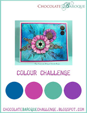
I made this card for the Chocolate Baroque Colour Challenge #16

And here is how it started.

I decided to get out my hardly used bister and have a play with it. I also got some stencils out – underwaterscene stencils as I wanted something underwater steampunk. Blue of the sea, green of underwater plants or rust, and the yellowish and purple for steampunkyness. I tried 2 methods, of which the last one is imo the best ofcourse – as then I stopped as the result was ok 😛

1.) Place the stencil on the paper, spray well with water and carefully remove the stencil. Take a bit of bister on a pallet (palet?) knife and gently shake it off. Could also use a brush but that didn’t hold enough powder for me.

Daqadoodles151021wo221653123 Daqadoodles151021wo221754124

As you can see, there is powder outside the wet areas, and in the wet areas there might be too much powder. Maybe I should have used a brush instead. Also, the colours don’t really flow yet – should I have used more water and risk having the water run under the stencil? I let this dry before I tried to remove the powder.

Method 2:Daqadoodles151021wo222131125

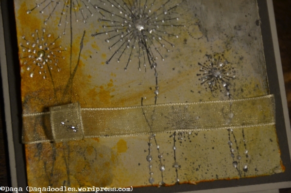
I think it’s clear what I did here – leave the stencil (wet as it is) in place and spread some powder over it. Ofcourse, it’s a waste to just rub the colour right off, so what do you do? Right, reverse stamp:Daqadoodles151021wo222241126 Daqadoodles151021wo222253127

Now this last one is the prettiest one! But too dark colours for hte challenge imo. Or maybe not. We’ll see how I finish it.Daqadoodles151021wo225041128

Here are the three results and the printed colour challenge image – doesn’t really look like it matches, does it? No, I didn’t think so either. The powder on the reeds below is removed, and as you can see it can’t all be removed. Maybe I should have used my magic static away dust pillow thingy?

Oh and another note: apply the bister / brusho on a different desk then the one you’re crafting on, the stuff gets everywhere and just a tiny speck of it has to come into contact with a tiny bit of wet water (I use my water spray a lot) and there’s a smudge on your card. Even if you think you wiped it all away. Maybe it would also work to not have your workspace so cluttered as I have 😛Daqadoodles151021wo230627129

Again the reeds stencil, but this time with inks. I usually gather all inks and paitns in the challenge colours so I can just go ahead and create instead of wondering during creating if the colour is right. Daqadoodles151022do011407131

Above: the gears stencil was laid down, then I applied some green and purple. It looked lovely. I spritzed with my home made resist spray, and made a reverse stamp of the stencil (seen in the next picture). I wanted the gears to be yellowish, so I applied the colour. The resists spray doesn’t completely block the colour, but in this case it let through too much yellow. Blergh. My idea couldn’t be realized – maybe I’ll find a new idea for it.

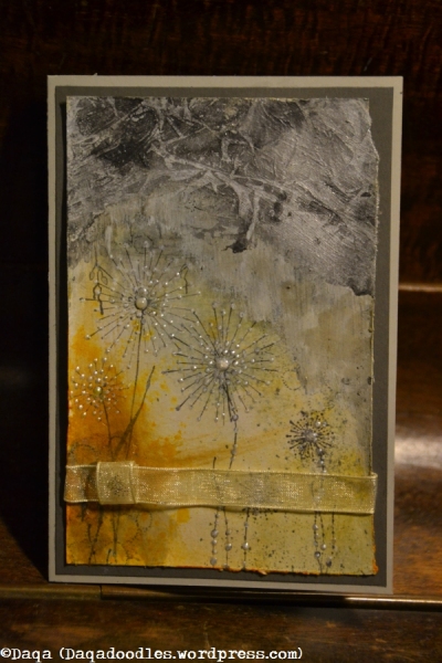
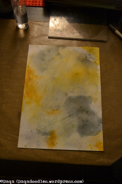
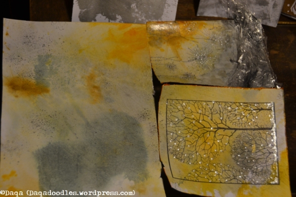
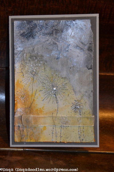
I was determined to get one card now. Between the “underwater” stencils is an airbubble stencil, and it gave me an idea: Acryllic paint should resist distress ink, so what if I use this as snow? Before I could do that I had to stamp the main image. And before I did that I wanted to stamp the background, the edge image. I thought the embossing would cover the background. The large tree is stamped and embossed with distress shabby shutters embossing powder – but oh noes! The background was still visible through the embossing! I really thought the embossing would be non-transparant.Daqadoodles151022do011355130

Oh well, lesson learnt. Don’t be lazy, cut masks. Then again, if I had cut a mask the background trees wouldn’t be visible through the main tree either. I put down the stencil and added picket fence paint throught it with the dabbertop. I was afraid it wouldn’t be “resisting” enough so I also took a pearl white paint dabber and randomly applied that, even in the tree. I like the effect of it, like the light reflecting on the snowflakes.

I coloured the gears and applied gesso to the treeparts that should not be visible, quite visible on the picture below.Daqadoodles151022do234352132

I applied distress ink on the sky, making it uneven as a sky (here) is hardly ever uniform in colour.Daqadoodles151022do234420133

Next steps I didn’t take pictures.. What I did was: stamp with stazon on the bottom part of the tree, as stazon IS darker. Also, the background was way to green, it should be more of a silhouette, so I went over it with my water brush dipped in Black sooth distress ink.I shaded the tree a bit and shaded some gears witha darker green, and last I added baubles in yellow and purple. The purple paper pen obviously isn’t fit (anymore?) for pearls, and the purple one is a bit more blotchy as well. Not waiting untill the card as dry (I had used a damp towel to clean off the embossing). It does look a bit messy. But then again…Daqadoodles151025zo164148136

It does fit the circles of the snow much better this way. These aren’t perfectly filled either, and it gives the card a bit more quirky look. Also the gessoed part looks good, it gives a bit of extra to the tree. Sometimes mistakes aren’t all that bad if you look at them differently.

Daqadoodles151025zo164124135


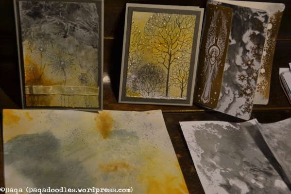
And now to find an envelop. As you saw I just started on approximately an A5 sized paper, and I cut it to a size that looked good. A while ago I didn’t care much for different sized cards, I made my own envelops. But that was time consuming and less fun then making cards, that is why I started making them A6 size so they fit in these C6 envelops. I like the craft colour and alternative opening, and they’re not more expensive then regular ones but they are more sturdy (only have to watch the weight of the cards more now).

Hema: 20 enveloppen in C6 formaat met zelfklevende sluiting.

Shelter

Daqadoodles151021wo005401140

Last entry for the Chocolate Baroque Colour Challenge # 15


It started out of that same paper as the previous card.Daqadoodles151019ma223527123

It’s the top left part. At first I had stamped the buddha branches on the top (with 2nd and 3rd generation ink stamping) but it was way to busy, I had added the flowers and white pearldrops then allready too. So what do you do then? Add a coat of gesso on it. I made a bit of a texture in it. First I brushed it straight down, then on the top part of the gesso bit I brushed it like a pointed roof. It reminded me of a shelter. I added some paint which should dry up with a blotty effect, but it was paint on spirits base (not sure how it’s called in english) and takes a long time to dry. It was transparent too, too white. That is when I got out my brushed pewter and silver acryllic paint – added a few drops on the top, some water, and kitchen foil. Let it sit and focus on the other cards.

Daqadoodles151021wo000511132

The effect when the foil was removed is great. It’s stoney, and the brushstrokes down give it more depth. And guess what, I even added a ribbon! I felt it needed some layering, some softening.

Daqadoodles151021wo005356139

Daqadoodles151021wo005332137

Oops, messed up the drop of stickles here… was looking for the shiny blingthingies which I never use but had found again and intended to use it for these cards and then when I needed them couldn’t find them…  Not sure if Ill add a sentiment to that card, I don’t think I will.

Daqadoodles151021wo005433141

I love the contrast on these pictures, especially from the Shelter card, looks like a thunderstorm and rain like this. Love how it turned out.

Now I’ve got some cleaning to do and get to bed (way too late!)

First snow

Do you remember, the eerie light, the night the first snow covers the world outside? Like light coming from everywhere, a soft illumination…Daqadoodles151021wo005229134

Ofcourse nothing like my card!

This is my 2nd entry for the Chocolate Baroque Colour Challenge # 15

Here is the piece of paper it came from:

Daqadoodles151019ma223527123

Daqadoodles151021wo000459131

Daqadoodles151021wo000401129

I wanted to use it as it was there, with the distressed edges. But it wasn’t right.

Daqadoodles151021wo005255136

Nicely framed with grey and straight lines is better, more view onto a scene like this.

Daqadoodles151021wo005236135

Also here, I’ve been doubting about a sentiment, or something else. The card makes me feel a bit.. what is the word… melancholic inside, a memory with a touch of sadness. I prefer to make happy cards, not melancholic ones, as I want people to be a bit happier when they receive a card. But maybe it doesn’t have this effect on others, so it’s good like this. Thanks for visiting again! Let’s see if I can make the 3rd post in time as well.

On a branch

No, this is not yet the lady sticking her head out of the leaves, this is another bird. My 2nd entry for the Chocolate Baroque Colour Challenge #13.

Daqadoodles150810ma120110007b

c64cd-cbc_12

It’s funny how colours change in my head once I’m away from the computer screen. This card was made for the Chocolate Baroque colour challenge as well. I remembered the colours as follows: kraft/plain cardboard coloured, yellow, green and purple. In a DT blogpost I read she used the new distress colour Amber, which I got the spray from so I was happy. I decided to use the yellow and brown as background colours, brown being Tea dye and brushed corduroy mostly. Put some resist spray between it (decoupage glue with some water in a spraybottle).  Add a window fragment and background fragment in the other two colours, and voilà, the background is ready.

Where? Or right, pictures ;).

Daqadoodles150802zo102522030b

Quite saturated colours, due to the amber. I sprayed with the amber spray first, then with the resist spray. Next I took my sponges tea dye / brushed corduroy and wiped it across the amber. Might have dded another resist spray after that. The window and little bush is stamped with toffee crunch from eh, that other brand. (Memento I think?). Used distress inks to give it some more colour (purples and greens).

And then I kept pondering how to finish it.

The DT was my inspiration, Anne’s Nordic Style christmas card. She said there: ” just love the reindeer – a bit fiddly to cut out but well worth the effort.” That text apparantly lingered in my mind (I know I thought about all the fiddly bits, and how I dislike fussy cutting and almost mutter to myself when cutting) and then I knew how to go on with this card: Add the focal thing on it, by (die-)cutting it out, so layer it. So I went looking through my stamps for a suitable image. It shouldn’t be a flower or plant, that’s too passive. Something else.

Daqadoodles150809zo223722002b

At the same time, I’m working on and off on a piece of walldecoration. It started out as Ikea packaging which I gesso-ed so the kids and me could paint together, but they didn’t feel like painting so I went ahead on my own, and now it’s mine… (See the post of Santoro Willow Guide where you can see how subconsicousness played a huge part in it!) Here I had just added indigo blu flakes, on the lower left a peacock , in the middle a dragonfly and under the folder another peacock. Inside the folder are some images I made earlier, the peackock on the right is very pretty, used metallic paints and all, but it went out of sight a bit. Anyway, a peacock would be great!

Only a bit too “great” – these two were too big, but luckily I also had a smaller one that did fit the card. Now onto the stamping. Embossing? yes. Which colour, purple? But the purple embossing powder is very dark after heating, almost black. Hmm clear embossing powder on a coloured background.

Daqadoodles150809zo223756004b

I lightly used all challenge colours in it, mainly purple. I decided I wanted some more bling, so I would emboss the top part of the bird with WOW copper embossing powder. No pictures of the result then. I fussy cut it out and added a white outline around the bird as it didn’t stand out enough, and I didn’t want to use black. I also added white gelpen in between the feathers and wiped across it with my finger right after doing so, making that space a bit diffuse/fuzzy/lighter. I took a Marianne Design die for the branch, used green and yellow (and a touch of brown) to colour it and glued it in place. Next I glued the peacock in place.

Daqadoodles150809zo233419006b

Also darkened the edges of the card more, to frame the image.

Daqadoodles150809zo233401005b

The top left and top right cards – not sure if I made these for the challenge, I made these when my kids were making cards (more on that in the next post). The colours could match the challenge. The flower is from my stash.  The top middle background was made with this challenge in mind, but this time using green and yellow.

Daqadoodles001

I finally found a use for that gold cardstock, here as the middle layer. Before gluing down the top layer I added a white outline around the card with white gelpen, as the card and gold were too similar in colour. The white seperates it so the gold frames it better. Mounted it onto some heavier cardstock and went outside for pictures.

Daqadoodles150810ma120143011b

My youngest son, (turned 1 in July) likes the card. Right after he grabbed it with two hands and bent it – luckily no creases to be seen.

Daqadoodles150810ma120125008b

A closeup of the top part, I also had added white gelpen around the eyes as they didn’t stand out enough behind the background.

Daqadoodles150810ma120110007b

The final card.

Forget that

Here is my entry for Chocolate Baroque Challenge #13.

I named this post “Forget that” as this isn’t my best card, there are things I did I shouldn’t have. But there’s no more time… so here I go:

Daqadoodles150804di153144003b


And the Challenge colours:

I read it as craft-paper coloured, a bright purple, green and yellow.

Daqadoodles150804di153157001b

The good: colouring of the lady.

The mwah: stamping the bold flowers with distress ink and not masking one petal off… it bothers me… grrr. Stamping with the distress ink was good though. I used a waterbrush to let the colours flow a bit, you can see that in the little petals and yellow heart/circles.

The shouldn’t-have-done: the crackle accent. You can see below it left an uglo gap on the right as well. Or should I have covered the entire card with it? Meh, just shouldn’t have done it.

Daqadoodles150802zo102605034b

To camoflage it I stamped the sentiment on the empty spot, but not entirely straight and a little too much to the left. On the positive side, now it looks like the butterfly is flying from her hair or sitting on it, that looks ok. The yellow hearts of the flowes (transparant yellow and opaque) are made with paper pens from viva decor (and the green and purple on her earrings too). Other colours are made with distress inks/markers. I added white gelpen for some highlighting.

It’s not totally bad, just should have stopped sooner…Daqadoodles150804di153136002b


To end this post, here is a picture of the A4 sheet the background came from and another card I am/was working on:

Daqadoodles001b

I liked the idea of making the lady purple. I like the left card (embossed with bronze/copper), but not sure where to go from here. I do know at one point I want to combine this stamp with the text “Forget not that the earth delights to feel your feet on the earth” while having her hung upside down from leaves :P. But that thought doesn’t help me finish the purple lady card… Maybe syrround her (only a small but, lower half,) with green leaves, and a little brown stem? Tips are appreciated 😛

Doodlediedum Landscape

A last minute entry again…

I posted on facebook allready the almost complete cards.

Daqadoodles002Daqadoodles003Daqadoodles004


Here are two completed ones: (Yup, one is only mounted on the cardstock, it didn’t need anything else).

Daqadoodles001

Added bright paper pen to the orange, and added more white highlights as the colours were too dull. Also added some moss green paper pen on the hill. Made with alcohol inks on the background, and distress markers, paper pen and whie gelpen on the foreground.

Daqadoodles001a

Made with distress markers and a bit of glittery whit acryllic paint for the moon.

0d9ec-cbc_11The first one (with the orange sky) is my entry for the Chocolate Baroque Colour Challenge #12. Although the second card turned out ok too, I still prefer the warm colours of the orange sky despite the not perfect stamping. I don’t use glossy cardstock often. Or rather,  I hardly use it. I thought it was time I tackled it, as stamping on it is more slippery, and colouring it is different. So I’m a beginner all over when it comes to glossy paper!

Daqadoodles150714di201552006


So for clarity, my entry:

Daqadoodles150714di201525005


And now I hurry off and add it before the link  has closed…

Wind in your hair

Another one made while on holiday, with diy resist spray, crushed olive, peeled paint, weathered wood, iced spruce, stazon claret and stazon pumpkin. And bundled sage, that seems to be a new favourite.

Also again a stamp from the beautiful stampset Essense of Nature .

Daqadoes150624wo102154003


I sprayed the resist s[ray and let dry, then I inked up the tree with the 2 stazon colours and stamped it. I then added the iced spruce and weathered wood around the tree, and peeled paint, budnled sage in the tree. Some more crushed olive in the tree and at the bottom. The text was stamped onto a separate piece treated roughly the same way and the same colours. It is glued down with foam dots so it is raised from the card. The butterflies are only accented/coloured with white gelpen.

Daqadoes150624wo101524001

The background of the card was pastel green, but it didn’t quite match so I put gesso over it, added some bundled sage distress paint, stamped cracked  texture from the Mail Art stamp set  around the edge with pumpkin and witped some more gesso over it to tone it down again a bit. The edges of the white backing card is inked with bundled sage and a bit of weathered wood.


This is my second entry to the Chocolate Baroque Colour Challenge #12. 0d9ec-cbc_11Daqadoes150624wo102154003

Bare feet

We went away a few days so I too packed half a crate with crafting supplies, having to choose in advance what to bring. While we were packing the car, the mailman arrived with a package from Chocolate Baroque! New stamps to play with. I also brought along loads of unfinished cards and backgrounds, forcing myself to finish some. And I printed out the CB challenge 12, and took only the distress inks with matching colours with me. I stil find it difficult to match colours from screen – is it bundled sage or weathered wood? Is it bundled sage or crushed olive?

I am going on vacation and I take along with me….

  • colour 1: Rusty Hinge – Brushed Corduroy (Stazon: Claret)
  • colour 2: Dried marigold – spiced marmalade (Stazon: Pumpkin)
  • colour 3: Peeled paint, crushed olive
  • colour 4: Iced spruce, weathered wood, bundled sage.

And I brought my tube with distressmarkers, although I don’t have all colours (got about half of them). Also brought water brush, water spray bottle, home made resist spray, distress paint bundled sage, distress paint brushed corduroy, paint dabber copper metallic. Craft knife, ruler, white gelpen, black gelpen, scissors large and small, mounting foam (as I had new stamps), stamps, stencils, sponges, acryllic blocks, cloth, paper/cardstock and ofcourse a craftsheet (no cutting mat – I forgot, but the envelop of the stamps worked good).

Now, my first entry for the Chocolate Baroque colour challenge #12:

Daqadoes007

Where to start with this one… I guess the background. I used a stencil (ginko leaves) from Designs by Ryn, sprayed it with the resist spray and let dry. (not the stencil ofcourse). Next I covered the paper with distress paint bundled sage, let that dry, then added some weathered wood – those are the darker stripes. I didn’t apply it in stripes – I had applied the distress paint that way and the ink was just filling the gaps. Daqadoes150623di154517013

I inked up the plant first with Stazon Pumpkin then partly went over it with Claret. After stamping the image I found it lacked the grounding part, so I took a sponge and applied stazon pumpkin on the bottom half and claret on top of it, more in the corners. It was way more then seen here on the image.

Daqadoes150623di154525014

I stamped the quote – I love it, a big reason for getting the set. (I’ll just ignore the fact the ink wasn’t good in all places).

The red was too present, so when I got home I added some stazon cleaner on it and wiped lots off, this also showed the resist effect more.

Daqadoes150623di154535001

The background – two frames on top of eachother (I always cut the middle section out to save weight while mailing it. The cut out sections ofcourse can be reused again.) I used the same stencil on the frames. My plan was to use different colours on the frames, but it turns out the colours of the leaves look lto be applied with the same colour, just different effects due to the base colour. On the largest frame I used weathered wood/iced spruce for the leaves, on the smaller frame I used a green one (bundled sage?). I did colour over it with distress inks and stazon inks, to make it blend more.

For once not the last week of entering the challenge… 🙂

Daqadoes150624wo102240002


Timeless

Just about an hour or so untill the challenge closes, so I’ll hurry!
Pictures taken just a few minutes ago, so bad light – I’ll edit the post tomorrowafternoon with some daylight pictures.

Daqadoes150616di233352003

With flash.

Daqadoes150616di233335002

I started with a background made with the Ginko Stencil from Designs by Ryn, I used Distress inks ofcourse. Chipped Sapphire (or Broken China or Faded Jeans? I used all three colours this evening…) and Cracked Pistachio and Peacock Feathers.  Also Dusty Concord and Seedless Preserves. After making the background I stamped some thistles on it from Chocolate Baroque, and then spritzed with home made resist spray. Next I embossed the butterflies on (stamp from CB). From left to right: Adirondack Stream embossing powder (quite a thin/fragile line). The next one is a brandless embossing powder picked up from a euroshop or bookshop. I notice the difference in quality, this one doesn’t “flow” or melt into itself as well. Next on the right is Ranger Blue Glass – this one melts very well into a thicker bit. Details can get lost but it adds indeed a blue glass look. The bottom row is twice WOW! Earthtone Grape regular, I’m always a bit disappointed how it turns out. Looks nice in the jar but a lot darker after embossing.

Daqadoes150616di233455004

I next coloured the butterflies partly with matching distress markers. Or almost matching (pine needles and peacock feathers for the Stream butterflie, Worn lipstick/Spun sugar for the middle one, tumbled glass/broken china for the Blue Glass one and Dusty concord and Stormy Sky (which is not like the distress ink Stormy Sky, the marker is quite purple). The thistles are stamped with Distress inks, seedless preservers and dusty concord. I took my waterbrush, made it quite weat and mixed the colours – also the background colours mixed in.Daqadoes150616di233516005

Then I added Crackle accents to the 4 butterflies on the edges, and glossy accents on the middle one.Daqadoes150616di233607006

Strange things the picture does to the card – The texture in the more pink butterfly isn’t as high here, and the colours in the lower right aren’t as .. oh wait they are. Didn’t look like that after colouring, but it looks great!

Next thingI did was ink the edge royally with broken china, so the butterflies stnad out more.

Oh and then ofcourse the sentiment – I applied some gesso on the spot where it would go and wiped it out with my finger, inking it up a bit with cracked pistachio. Embossed the sentiment with Ranger super fine detail black embossing powder.

Almost the last thing I did was spray it with water to get the drops effect. Ofcourse last thing I did was make up the card as seen.

This was my 3rd entry for the Chocolate Baroque Colour Challenge #11

734be-cbc_10


Now the bonus card:

When I have to wait for something to dry I make another card. This often results in 4 or 5 backgrounds/cards which I am working on in one session. Usually 2 or 3 are finished. I was playing around with the thistle stamp a bit, I liked it 🙂

Daqadoes150616di233839001

I used the same distress inks and embossing powders as before. I inked up the bold thistle stamp and sprayed it with water to get a more blurry effect, I repeated this several times. Then I took the other thistle stamp and used another colour and stamped it.

I spritzed with resist spray and let it dry.Daqadoes150616di233645007

I inked up the rest of the card with blue/green colours.

Embossed the bubble wheel. Next was the fish. I didn’t mask it off when stamping the fish with embossing ink (wiped the embossing ink away in the bubbles and then wiped the embossin powder that ofcourse now stuck to the whole bubble away. The seahorse is stamped with Stazon Midnight blue – I didn’t want it to stand out as much as the other two stamps.  Daqadoes150616di233745009

I felt the detailed thistles weren’t clear enough, and the bubblewheel was too much at the front (should be behind the plants more) so I stamped and embossed the detailed thistle several times with a mix of the pink/purple embossing powders. Looked better now. Then some simple colouring with markers.Daqadoes150616di233726008

Don’t pay attention to the stamplines – I’ll have to cut the stamp a bit narrower or stamp more carefully next time. I added glossy accents to the bubbles and eyes of the fish and seahorse and mounted the card as seen.

Tomorrow hopefully some daylight pictures – it looks like bronze embossing powder but it’s black, I promise!

Thanks for visiting 🙂


Daylight pictures:

Daqadoes150622ma150549005

Autoadjustment from Photoshop:Daqadoes150624wo102228005

Daqadoes150624wo102213004