Hallucinations

From lack of sleep… tired.. been to Hamburg this weekend with my sisters, it was wonderfull, but getting back and working early next day, followed by a night with not much sleep due to a baby wanting to throw a party in the middle of the night is a bit too much maybe.

A while ago I told you (goodbye lullabye part 1) I got sidetracked (goodbye lullabye part 2) while working on one project, and made a bunch of backgrounds of which I had no clue of how I was going to use them due to the bright contrasting colours.

Daqadoodles150417vr233012038 Daqadoodles150417vr233002040Well I took on the challenge, and used one sheet, the turqouise with orange bubbles one.

This is how it turned out:Daqadoes150515vr114315005

Modelling paste through one “sun” pattern, covered wit hcopper acryllic paint. Other places only acryllic paint.  Not sure what I used to colour the turtle: distress ink and/or Caran D’ache neon colour crayons.

Daqadoes150515vr114219003

Stamped the seadragon for placement, then added gesso on and over the stamped image, heat embossed the dragon with distress embossing powder and coloured with Caran D’ache neocolours. Embellisments (diecuts) are from my stash. The card is matted onto a white card on wich I painted a messy frame in copper.

Daqadoes150515vr114411001

Daqadoes150515vr114357006

Daqadoes150515vr114225004

Daqadoes150515vr114203002

One of these is my last entry for the Designs By Ryn May challenge. I think I’ll choose the seadragon, as I like how it looks somewhat plastered on, like he is in his own bubble.

Edit: I chose the turtle, it’s better photographed / better visible.

And now, bed!


A last minute move


A last minute post for the Chocolate Baroque Colour Challenge #10.

Daqadoes150519di232032010

As it’s last minute, it’s nightphotograpy unfortunately. I’ll see if I can get a daylight picture edited in this week.

I started this card by placing a stencil and going over it with distress stain bronze. I then lifted off the stencil and placed it on another piece of cardstock (This is where the chessboard is stamped and cout out from), so there’s the positive and negative image of the stencil. I then applied ink – a mix of shaded lilac & dusty concord, spun sugar, and again a mix of victorian velvet and seedless preserves. (although dusty concord and seedless presevers could have been swapped). The metallic stains act as a kind of resist, so it still stands out a lot.

I stamped the chessboard onto the other cardstock. I had inked it up with  Stazon cherry pink and violet (something). I added some more white pen on the chesspieces and castle, but it didn’t really cover the distress stain so I left it as it was.

I had started other cards before this one, but the balance of colours was always off, there wasn’t enough white in it. So I left the chessboard just as it was, it was good like this.

Daqadoes150519di232155007

I glued the card in place onto white cardstock, leaving a strip of white on the right side for balance. Oh I almost forgot, I stamped and heat embossed the text ofcourse.

Daqadoes150519di232005009

So that’s it, it was a difficult challenge for me this time again and a lack of time also, but I am satisfied with the result, although I like the other card I made more. Thanks for visiting!

Edit: the outdoor picture taken this morning, no sun / bit cloudy:

Daqadoes150520wo064324002

Silver moon rising

Moonshadow

Silver White moon man

Silent ascension begun

Fill me up with dreamsDaqadoodles150507do111520001

I saw this stamp at De-Stempelwinkel and liked it a lot, so what do you do then? I wonder where the text comes from, who wrote it.

Anyway, the card. I made it in the last 2 or 3 weeks, and I forgot what I did on the background. There’s lots of stenciling – I see some art deco arches (Stampinback.nl?) in wild honey slightly on the card, and sunbursts (Dutch Doobadoo). sec, getting the card…. aaah the white in the background are giant stitch crosses from a A3 sized stencil from Marianne Design of Joy Crafts. It’s a reverse print of the stencil. So 3 stencils, it was getting a bit busy. I had this new stamp and watned to try it out, so why not this card?Daqadoodles150507do111554002

Ooh ascension… fill up… drops rising up, but not in the sea, it should be more dreamlike, more moonlike. Silver waterbubbles. I stamped in on top of the text, as I figured the text would be visible enough – I think I should have wiped a bit more embossing powder off it at the text, but the look I wanted (bubbles going before the text) has succeeded. Embossed the bubbles with pearlsilver embossing powder.  Also added a fairy, but removed her wings (wiped the ink from the stamp) and only very slighly went over her with a wet brush to mix the colours in her dress more. She’s a moonghost now, hardly visible, like when you try to hold on to a dream.Daqadoodles150507do111622003

I added drops of glue onto the bubbles for some body, I wanted to know if I could get the same effect as glossy accents with it. Tip: don’t put the card in upright position when it has drops of something on it.

Daqadoodles150507do111636004

LAst but not least, I wanted to use some dies agan. It’s been ages since I used them. I didn’t want a forest scene, or sea scene, but some sort of mix between it. Like seaitems but above ground, like a fog in which magical things can be seen. The thing the items have in common is the coloursetting. The backcard is coloured in Stormy sky too, and the middle matted card has the crushed olive and forest moss.

It’s a strange card. But is it strange in the way it’s supposed to be, with water elements in the air, grass in a sea? Is it dreamlike strange?

This is my second entry to Designs by Ryn Customer Creation Challenge – May.

Not sure if the text is featured enough for the Challenge of De-Stempelwinkel, which is Surrealism these two weeks. (Oh wait, they sell also the stamps from Designs by Ryn!) I hope dreams are surreal enough!

Spring is pink

I posted a snapshot of the finished background on facebook allready, but here is how I made it.

Daqadoodles150409do193610001

Put some pink/soft purple tones on the paper, then place the stencil and go over it with a brighter colour. Make sure it’s dry, and use anti-static bag. Put the stencil back in place, dab some embossing ink through it with a sponge, remove the stencil ans sprinkle clear embossing powder on it. Tap off the excess embossingpowder (ofcourse pour it back in the jar) and heat it with the heating tool.

I’m not sure if I added the dots before or after this, could very well be before this step. The dots are a tim holts stencil, and one part was done with mdelling paste and acryllic paint and the other with ink spray I think. Not sure anymore…

Daqadoodles150409do194117002


Next, take some contrasting colours (not too hard, but light) and ink it over the image.

Below the paper is cut in 2, for 2 cards. First picture is with a flash, second without.Daqadoodles150409do194539004 Daqadoodles150409do194525003

This last card turned into this one:

Daqadoodles150415wo084156002

I added the butterfly, it was a precut vellum shape, which I coloured with alcohol inks a while ago. The stamp is from ArtSpecially.Daqadoodles150415wo084140004 Daqadoodles150415wo084148003

The second card still isn’t finished, I got a very pretty fairy to put on it, but it covers too much of the background. Maybe I should leave it as it is? Less is More? Hmm. but the fairy matches it so well… I guess I’l have to make another background like this.

This is my first entry for the Designs by Ryn May Customer Creation Challenge.

WOYWW #x – Workspace then and Now.

It’s been a while since I participated in WOYWW, and I am not doing so now as this post has been ready for a while but somehow I don’t manage to post it on Wednesdays. Didn’t participated for the most common reason: major lack of time to be online. I knew I wouldn’t have the time to visit people, so I didn’t participate. I still don’t have much time, but I’d like to show the changes made to my workspace.

Before

An open cupboard, (actually an IKEA PAX cupboard, 58 cm deep, 100cm wide, 236 cm high) with a curtain (from the childrens room from the previous appartment) in front of it. Lots of storage space, but not it didn’t turn out very convenient as I had to keep moving stuff to get to the stuff in the back.

This is how much of my stuff is stuffed away.

This is how much of my stuff is stuffed away.

Turning around, you can see the table, and 3 chests of drawers. Or actually, you can only see one. Two are stacked, and the other one is next to them, below the shoebox decorated with white-rosed paper.

Daqadoodles140819di223047

Here you can see the two stacked ones.

Wednesday 00:40

Wednesday 00:40

Now

(Or rather, end of february 2015). I got another pax, the less deep one (35 cm, still 100cm wide and 238 cm tall) and added doors. Our current bedroom is differently shaped and a bit smaller then the previous one (moved april 2014), so we got sliding doors instead of these hinged doors. At first, I didn’t think they’d fit well in our living room. But now I think they do, it looks way better then the curtain, it looks less cluttered as the floor and cupboardoors match quite well. Also, as you can see, the tower of drawers is now next tot the cupboard.

Daqadoodles150228za001322006

Which makes it possible for the tabl e to be extended more, and which makes it look more calm in that corner. (just hink away the mess on the table).Daqadoodles150228za001041005


Then onto some (I think clever) storage system. You know how supermarkets sometimes have special offers where you can save stuff? This sheet of metal is from Jan Linders, you could save grocery magnets so the kids could make a grocery list with images. The backside is covered with chalkboard paint.

With double sided tape I stuck it to the door and added some of the sizzix movers and shapers dies to it. This way I can SEE them, and therefore hopefully use them more. I added some tape at the height of the shelve, as I shouldn’t put dies there – they’d hit the shelve if I do. I did add a little helper thingy there, that small square isn’t a die but is meant to be able to lift paper out of sizzix bigz frame dies more easily.

Daqadoodles150228za001513008

Note that purple thingy on the cupboard door? It´s a Grippy. It´s meant to keep your cellphone from sliding all over the dashboard of your car. It´s made of the same material as the old slimy hands which you could throw against a wall and then it would walk-climb down. We liked it so we bought a few to give a way as gifts to other nerdy friends, but we forgot about them. Later when I found them I thought I might be able to use them. Now I use them indeed… Put it on an acryllic block, put your unmounted stamp or mounted-but-not-sticking-stamp on it, and voila! Same effect as the tack’npeel, only now both sides are tacky instead just one, and you don’t attach it permanently to your acryllic block. Reason I used this is that I didn’t have a large enough size of tack ‘n peel on an acryllic block, and you attach the tnp permanet to a block. I don’t have multiple same sized big acryllic blocks so I didn’t want it permanently attached.


On the other side I stuck two A4 magnetic sheets. I didn’t have any more at the time, meanwhile I have added two more to have a bit more space for my dies. Many dies are on there, some that aren’t are nesting dies, I still prefer those in the metal tin (that used to hold pencils) which I lined with magnetic sheets as well. Now it is very easy to see my dies and pick one. I haven’t noticed I used them more often by the way. I love dies, I keep buying some occasionally, but I don’t use them a lot anymore, I often find it hard to combine them with stamping.

Daqadoodles150228za001440007The bottom shelve is still unsorted, I just stuffed all (or most) remaining paper there. On the next shelve are my binders with stamps, stencils, inventory list, spare mounting foam and a few stuff-tainers.

The third shelve: on the left part in the back are A4 papers/cardboard in my self made magazine files (made from cat litter boxes). I hardly use those papers. In front some tins with brushes and the plain tape. In the tin with the apple on it (stroopblikje) are brushes which my kids are allowed to use. Next to it, HEMA correspondentie kaartjes which I bought recently, I quite like them. In the brown box is A5 cardboard in several colours or designs. Don’t use those often either. Sometimes as backing card. In the blue plastic bin are the larger sizzix dies, many of them second hand. On top of it, you can see the pencil tin which hold some nesting dies, and on top of that a lightly decorated shoebox with unfinished cards inside. I have a new stack to add to it.

4th shelve, more little and big shoeboxes. Above it a shelve with A3 sixed paper and other bits that don’t fit on another shelve.

6th shelve, (6th if the bottom is a shelve too, that is): lots of small shoeboxes. My sponges are on there, distress markers, a very nice wooden alfphabet stamp set.

Shelve above that contains stuff. (Mostly used item from this shelve: the glues that are on the front. The other boxes are much less used).

Top shelve: acryllic paint, finger paint, childrens paint and finished cards. Stored out of reach of enthousiastic childrens hands. Ofcourse, the paint should be in the plastic bin with the yellow lid behind it, but you know how it goes… you grab some paint out, put the bin back, use the paint, clean up everything and quickly store the paint somewhere near the place it should be stored.

Nowadays I don’t buy those large containers of paint anymore – it’s good for large projects but I hardly have those. Now it’s just the ranger paint dabber/do crafts/alleene’s/hema small sized acryllic paint containers. Those fit into the drawers on the right.

The pictures were taken a few weeks ago, currently working on a different project.

Oh I made one more change to the workarea, this was before Easter to be able to hang up some cholates. Let me make a picture, brb!

….

…… sorry it took a bit longer, ofcourse cleaned the table empty (still was stuff on it) and removed the chair with all the clothes.

Bundis upcycled – I’ve always wanted a decorating thing ( those circles which hang above a table and you can decorate?) but not enought to actually buy one. We didn’t have space to hang it anyway. But I wanted to hang up chocolate easter eggs! So I made this, and hung the eggs beneath and had put young plants/seedlings on top.

Daqadoodles150506wo234247003

The eggs are ofcourse eaten, the seedlings gone outside, and the space reclamed for my glass jars.

Beneath it now are 3 hearts – the smalles one is from Freya, she got it from one of my sisters on her birthday. The other two was a gift for me, they were plain white and for me to decorate. I’ve decorated one with alcohol ink, then put a varnish on top and then stmaped the drops. Problem is I stamped with Versafine rather then Stazon, and oily ink on varnish is not a good idea, doesn’t really adhere/dry. Still have to do the edges and the other side. Oh, and the other heart as well ;)/


Daqadoodles150506wo234743004

The kids aren’t allowed on the table and know glass can break. They’ve left it alone so far, only time when they wanted to get something is the hearts or the mini chest. The hearts can be seen in the bottom of the closet – still brown/not painted. Here, my kids have painted them. For Denise Silva from https://sdenisesilva.wordpress.com/ I’ve put the tissue boxes on the table.  Oh and I altered/repaird my Ikea lampshade a bit more. See here for the first part – now I have repaired the two holes on the edges. Didn’t have that decoupage paper anymore so made my own using plain white tissuepaper and some distress colours.
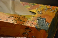
 

Storage

Ryn from Designs by Ryn asked how people store their stamps. While I was making a picture of it, I thought, why not present my entire storage system. Not all of it is perfect or works well, but it is what I have / use at the moment. I’ll share pictures and pro’s and cons of it.

Unmounted stamps on cling foam

Most of my stamps are mounted on cling foam. It saves space and I like working with acryllic blocks, it allows me to determine the position of the image better due to the outline of the stamp. I can easily place the stamp straight on the block and then line up the block with the edge of the paper.

I store the stamps laminated sheets which I put in binders:

  • bought sheets with 4 holes in them (at Chocolate Baroque);
  • bought sheets with 3 holes in them.
  • Self laminated sheets with self punched holes.
  • In binders per manufacturer: Easy to flip through for inspiration or to get a certain brand out for challenges. Just pick your ordner of brand (and style) of choice, put it on the table and start.

    Daqadoodles150505di092557023

    I started using an acryllic sheet to protect my stamps when opening the folder, also I put those in between when I am using the laminated sheet on 2 sides, so the stamps don’t press into eachother.

  • bought sheets with 4 holes in them (at Chocolate Baroque);
    • + : fits in to regular binders with the 2 pins.
    • – : in the 2 pin binders the holes are more strained, so they wear out sooner.
Daqadoodles150505di092430020

Celtic symbols from Designs by Ryn. (Ok it’s actually called wintersheet I think, but I prefer a seasonless name :P)


  • bought sheets with 3 holes in them.
    • + : 3 pin binders are less common in my house (never looked for them in stores, usually there’s the 2 pins there I think), but I have one or two binders who have 3 pins. They fit well in there.
    • + : The force on the sheets is more divided between the holes, the sheet has less room to wiggle around so the holes will tear less easily.
Daqadoodles150505di092419019

You could also use custom made backgrounds, here I only spritzed with orange inkwater. Beneath the samp you can see the sheet/image of the stamp, so I have all the information ready. You could laminate the original paper, but I scanned it and printed it out, as I use the originals in another binder, my index binder. Ofcourse, you can also just stamp the image and write the details of it by hand, but now I’ve got the logo of the designer (Designs by Ryn) on it as well.

Daqadoodles150505di092511021

Here I mainly gave the sheet a title (Deep Red), and stampd all images on the paper, wrote the stampsname and number beneath it and laminated it. I only forgot about the holes…ooops… It just fits, but I should remember that next time (make a “kantlijn”- a margin line?)


  • Self laminated sheets with self punched holes.
    • + : no uneccesary holes, make as many as you need in the right places
    • + : you can laminate the stamped image / manufacturer
    • + : it’s cheaper
    • +/- : even with laminated cardstock they seem a bit more bendable then the bought ones. This could be fixed by adding an extra sheet of carstock, but then the cardstock has to be made smaller then it is now for laminating. There’s a 3-4 mm edge now with standard A4 sheets which is good, but for thicker paper this edge shout be wider.
    • ?: I don’t know what the sheets are made of, so don’t know the long term effects on the cling foam.
Daqadoodles150505di092629024

I started redoing my binders, as I used to have the stamps stored face up on the page so I see the stamps when I browse the binder. But this one had the images on the left side, stamps on the other side, face down. Hmm isn’t that a good idea? Daqadoodles150505di092707025Have the image on one side, and the stamp on the back? The disadvantage is maybe more stamps falling off while browsing?

  • I forgot a 4th one: Sheets that are allready “ready to use


Mounting foam

Sometimes normal foam mounted stamps fall off. I can’t remember on which sheets they have been stored – I’ve moved them around a bit. It’s also the usage /dust that makes them less sticky. I get them to stick again by making sure the cling isn’t dirty, then rubbing it on my clothes to try to enhance the static part of it again. This doesn’t work for all though.  Other, better tips to revitatlize cling foam is much appreciated!

Cling foil

In the previous picture you can see a stamp sticking out – It’s a background stamp with cling foil. I don’t know the exact name, but it’s not the EZ-mount foam, but more like a plastic cover which shows the image. It doesn’t stick well to laminated sheets. It’s so annoying and can damage the stamps, as when a stamp falls off and I put a binder back in the cupboard I might put it half on the stamp so the stamp is dented… happened once..

Stamps with this foil are often stampendous stamps / hero arts big stamps. I would really appreciate tips on how to make them stick to the acryllic block, cleaning them with a wet cloth doesn’t help. Even directly new out of the packaging they don’t stick well, I’ve had them all inked up falling off acryllic blocks onto my project :(. Now I used them in combination with Tack ‘n Peel, like the unmounted stamps. So the stamping part is sorted, but not the storing part. Tips?

Clear stamps

I store them on the same laminated sheets. Small stamps I might store in thintainers.

Daqadoodles150505di093935001

Unmounted stamps without cling foam

Daqadoodles150505di093007029

Not the best solution, I know. It was origianly a box to store stamps that still had to be mounted, but then it became a storage for the small stamps. I don’t mount them anymore, I use Tack ‘n peel. The two acryllic blocks on the picture have this on them, the left one had it on for a while (I hardly clean it, if I would, it would be more transparent still but it’s fine like this). I put some leftover tack ‘n peel on the right one just a few evenings ago. Works good for small stamps, thought be careful with very thin rubber stamps (like The Stempelwinkel), it theoretically is possible to tear the stamp when pulling it off.

Mounted stamps

Some I store in Thick Stufftainers (see a previous picture), others are stored.. well.. like this:

Daqadoodles150505di093836032

It’s not really stored, it’s more like… gathered in this box so they wouldn’t be roaming about.

Indexating and masks

Now, how do I know which stamp is where? I write on the binder which designer/brands of stamps are in it. Designs by Ryn and Chocolate Baroque have their own binders, other brands have to share. For more easier browsing images I have a showcase album. I put the imagesheets from the manufacturer/designer in, if the image is on the sheet. If not, then I have to stamp them and then put them in the file. Or only the empty backingsheet (with usually the brandname and stampname) goes in, as a reminder I still need to stamp it…

Daqadoodles150505di092859028

You can see on these images my own made masks, made from normal (coloured) paper and spray glue – the glue should be non-stick if left to dry after spraying, but I’ve found it does stick eventually a bit too much. I’ve looked around for another (cheap) easy solution and I found one.Daqadoodles150505di092824027

Here are the Designs by Ryn sheets, and the masks are stamped onto (mostly) transparant) self adhesive window foil (zelfklevende transparante raamfolie). The advantage of these showcases is that I can put the masks on the image, so I won’t loose them and it’s easier to reuse them. Making a mask can take some extra time, but then you won’t have to do it again for quite a while, if handled well the masks lasts long. Do make them less sticky before sticking them onto your paper though! You can do this by sticking them onto your clothes and/or skin. Test on some scrappaper, I’ve been in a hurry and didn’t do this properly after making a mask, and put it down on still slightly damp paper… when taking it off it tore off a small bit of the top layer. I could repair it luckily, but still.

Cutting dies

I’ve mentioned these before:

Hmm oh right, that is still a concept post… Ok retry: I’m mentioning my entire workspace/storage area including the dies in an upcoming post. [edit: here!]Here’s a preview:

Daqadoodles150505di093803031

Stencils

Last, my stencils. They were in that showcase album before too, but it didn’t fit anymore so I searched for something else.

Daqadoodles150505di093712030

This is another showcase folder, and it works ok. I haven’t really sorted the stencils in there as I like browsing through them. Ofcourse you could sort them on brand/designer, theme, size etc, and I have done that for quite a while. Only when I am in a rush (or have made it later then bedtime allready) I’m not very picky about where I put the stencils back in. I just put them in a pocket that isn’t too full allready. I probably will sort them again in a while untill it’s a complete mess again.

If it wasn’t clear yet that I’m addicted to stamp and stencils then I think it’s clear now… I have more then enough of them, I should stop buyin…oooooh pretty stencil on sale….brb!

Any questions or tips? Please share!

Making Berry Inks (Huckleberry, Raspberry, Blackberry, Pokeberry, etc.)

This week I came across an e-book, called Perma Art, and it was about making your own art supplies. I also bought another e-book about green crafting. It seems to be quite easy to make your own non toxic, non environmental damaging ink! So ofcourse I set out to make that this evening. I’ve boiled some plants, nearly set the house on fire (was called upstairs to help with the kids and forgot about the pots on the stove. Suddenly a smell… oops… rushed down, the waltnushells/onion pot had cooked dry. I’ve still got some scrubbing to do to clean that one out.
Anyway, the ink I got looks ok, but very light still. Also, it needs some preservative. But what? Is vinegar ok, or should I use alcohol? And do I need to make it less fluid? The books mention ingredients I don’t have yet. And what are all those ingredients in Dutch? I know some translations, but sometimes it really is important to get the right thing – soda and baking soda for instance are not the same. (No, not used in ink, but for homemade washing detergent).
I searched online for more info about home made ink and stamping and came across this post, which looks great:

The Druid's Garden

Inkmaking is a wonderful way to use up some of the fabulous berries that you can forage for outdoors or grow in your garden. With a berry ink, you can do wonderful water washes, use a dip pen and write great letters, or use it for various drawings and sketches!  You can also use your ink for spiritual journaling or magical work.  Having an ink you’ve made yourself allows you to be creative while making use of sustainable materials that are locally harvestable!

Which Berries to Use?

You can use any berry that has a nice dark stain when you cut it open.  The list that I’ve made ink from, and the colors they produce, are as follows:

  • Huckleberry (Garden, Wild) – Produces a nice denim blue ink (PHOTO BELOW)
  • Pokeberry – Produces a hot pink ink (please don’t eat these berries, they are poisonous) (PHOTO BELOW)
  • Buckthorn, common –…

View original post 1,338 more words