We went away a few days so I too packed half a crate with crafting supplies, having to choose in advance what to bring. While we were packing the car, the mailman arrived with a package from Chocolate Baroque! New stamps to play with. I also brought along loads of unfinished cards and backgrounds, forcing myself to finish some. And I printed out the CB challenge 12, and took only the distress inks with matching colours with me. I stil find it difficult to match colours from screen – is it bundled sage or weathered wood? Is it bundled sage or crushed olive?

I am going on vacation and I take along with me….
- colour 1: Rusty Hinge – Brushed Corduroy (Stazon: Claret)
- colour 2: Dried marigold – spiced marmalade (Stazon: Pumpkin)
- colour 3: Peeled paint, crushed olive
- colour 4: Iced spruce, weathered wood, bundled sage.
And I brought my tube with distressmarkers, although I don’t have all colours (got about half of them). Also brought water brush, water spray bottle, home made resist spray, distress paint bundled sage, distress paint brushed corduroy, paint dabber copper metallic. Craft knife, ruler, white gelpen, black gelpen, scissors large and small, mounting foam (as I had new stamps), stamps, stencils, sponges, acryllic blocks, cloth, paper/cardstock and ofcourse a craftsheet (no cutting mat – I forgot, but the envelop of the stamps worked good).
Now, my first entry for the Chocolate Baroque colour challenge #12:
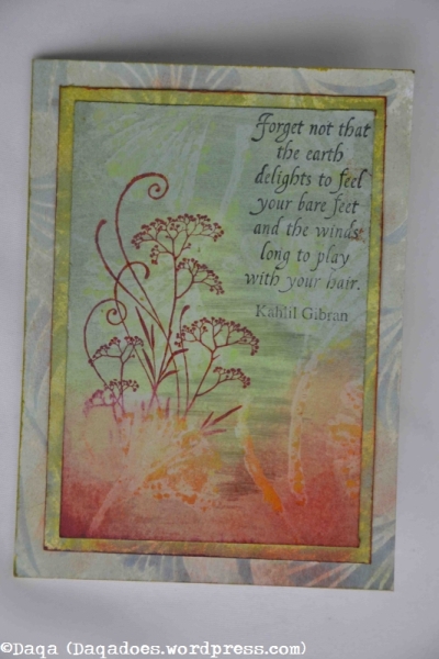
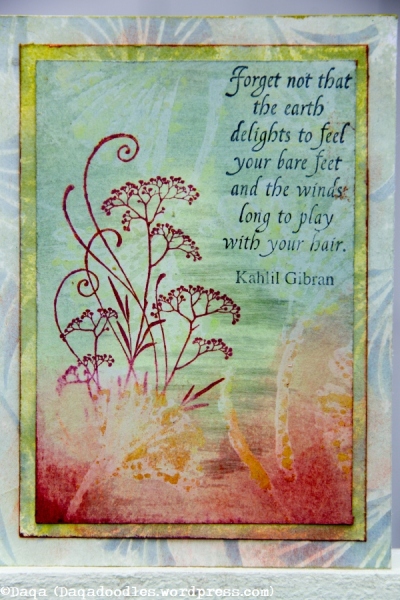
Where to start with this one… I guess the background. I used a stencil (ginko leaves) from Designs by Ryn, sprayed it with the resist spray and let dry. (not the stencil ofcourse). Next I covered the paper with distress paint bundled sage, let that dry, then added some weathered wood – those are the darker stripes. I didn’t apply it in stripes – I had applied the distress paint that way and the ink was just filling the gaps. 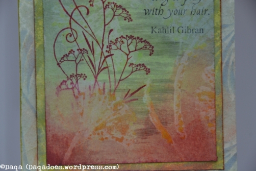
I inked up the plant first with Stazon Pumpkin then partly went over it with Claret. After stamping the image I found it lacked the grounding part, so I took a sponge and applied stazon pumpkin on the bottom half and claret on top of it, more in the corners. It was way more then seen here on the image.
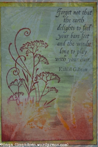
I stamped the quote – I love it, a big reason for getting the set. (I’ll just ignore the fact the ink wasn’t good in all places).
The red was too present, so when I got home I added some stazon cleaner on it and wiped lots off, this also showed the resist effect more.
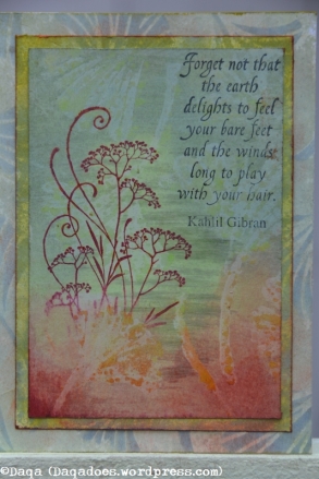
The background – two frames on top of eachother (I always cut the middle section out to save weight while mailing it. The cut out sections ofcourse can be reused again.) I used the same stencil on the frames. My plan was to use different colours on the frames, but it turns out the colours of the leaves look lto be applied with the same colour, just different effects due to the base colour. On the largest frame I used weathered wood/iced spruce for the leaves, on the smaller frame I used a green one (bundled sage?). I did colour over it with distress inks and stazon inks, to make it blend more.
For once not the last week of entering the challenge… 🙂